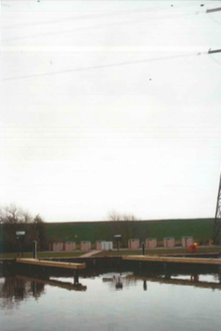
Pinterest board
Gallery visit - the photographer's Gallery
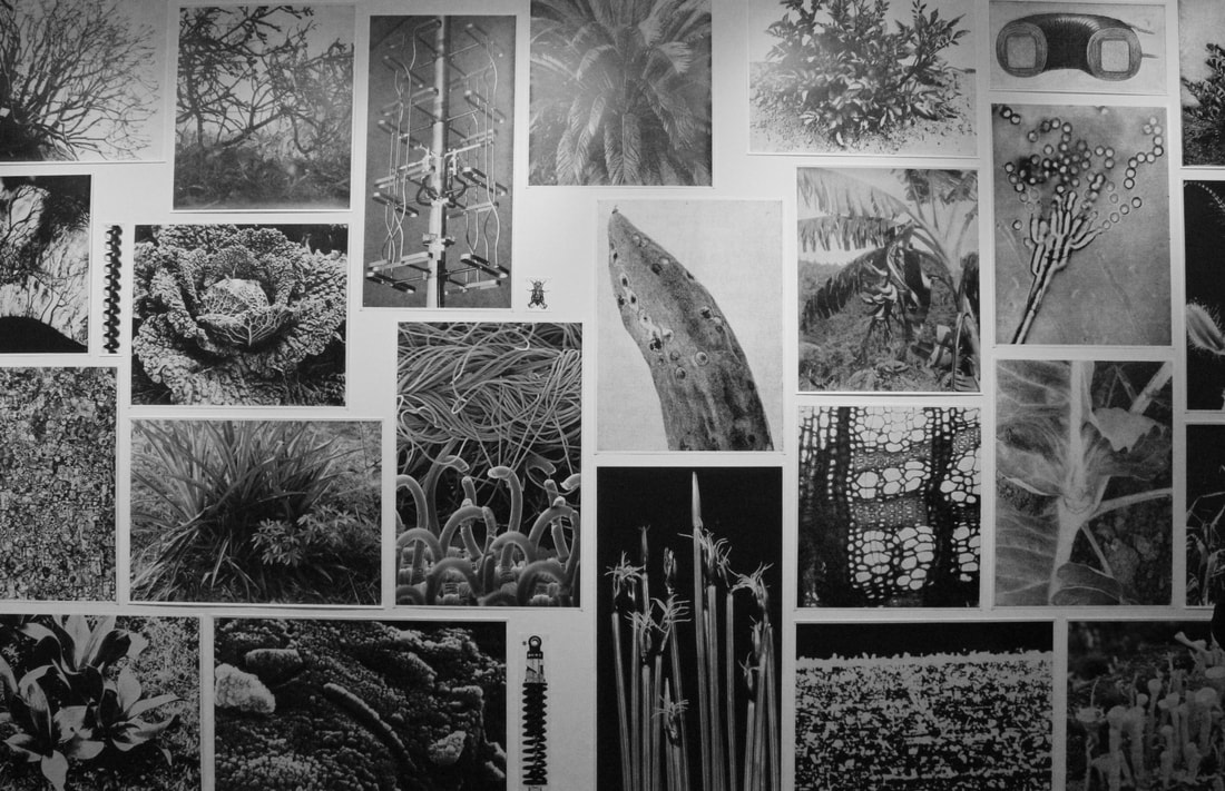
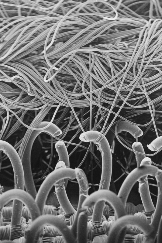
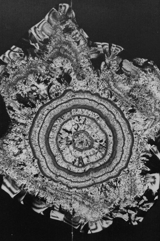
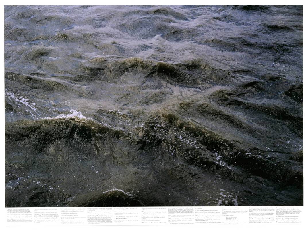
1. Batia Suter
|
Batia Suter was born in Switzerland in 1967. She produces large prints made from a collection of images to create a collection of images that demonstrate iconographic transformation of images and how photographs can be altered to have a new associative value. In her series Parallel Encyclopedia #2, Suter has produced a composition of carefully chosen images, sourced over 1000 publications such as non-fiction, textbooks, historical volumes, advertisements and magazines. She has combined, edited and repurposed the images so that they fit together perfectly to give a new value to each individual image. In her series 'Parallel Encyclopaedia 2', Batia Suter's photographs connect to the theme of freedom and limitation because she limits the amount of the subject shown in each photograph by using a macro lens, which creates a surreal effect and makes it difficult to see what the photograph is of. I find it interesting how she has chosen a series of unrelated subjects, but made them connect by arranging them in a certain way so that you can only see that the photographs are unrelated when you look closely.
|
|
|
|
|
|
Gallery visit part 2 - the photographer's gallery - Under Cover
This exhibition explores the history of cross dressing between 1880 and 1980, and is drawn from the personal archives of film maker and photography collector Sebastian Lifshitz, who collected the series of photographs from garage sales, junk shops and eBay, exploring cross-dressers from prisoner of war camps, universities, circuses etc. This exhibition relates to the theme of freedom and limitation because it explores how people have been limited from expressing their true identity for many years - having to hide their true selves in fear of being rejected by society. It was interesting to see how the history of cross-dressing has changed since 1880 and to compare how it has become more accepted in society over the years.
Half term task - Framing
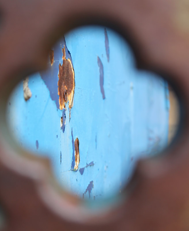
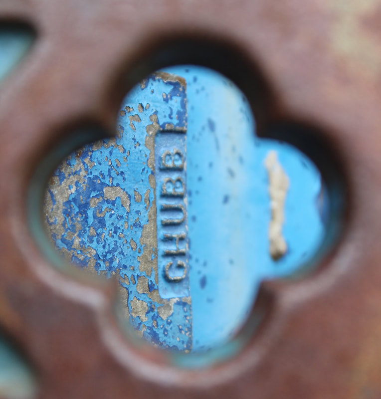
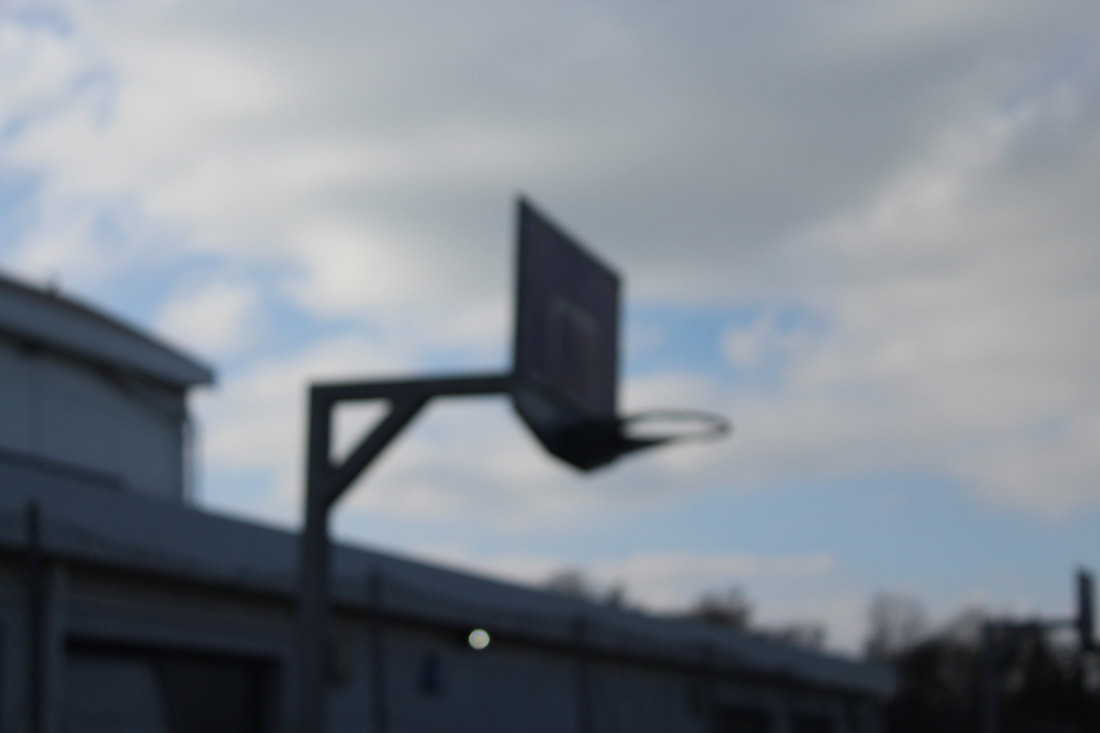
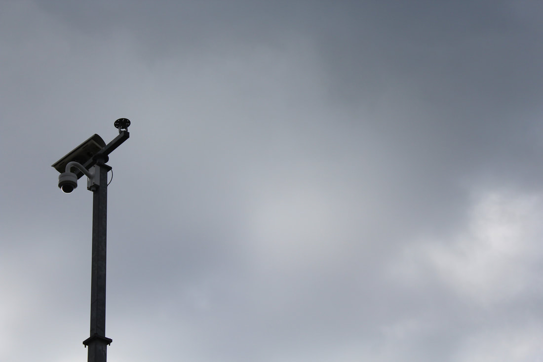
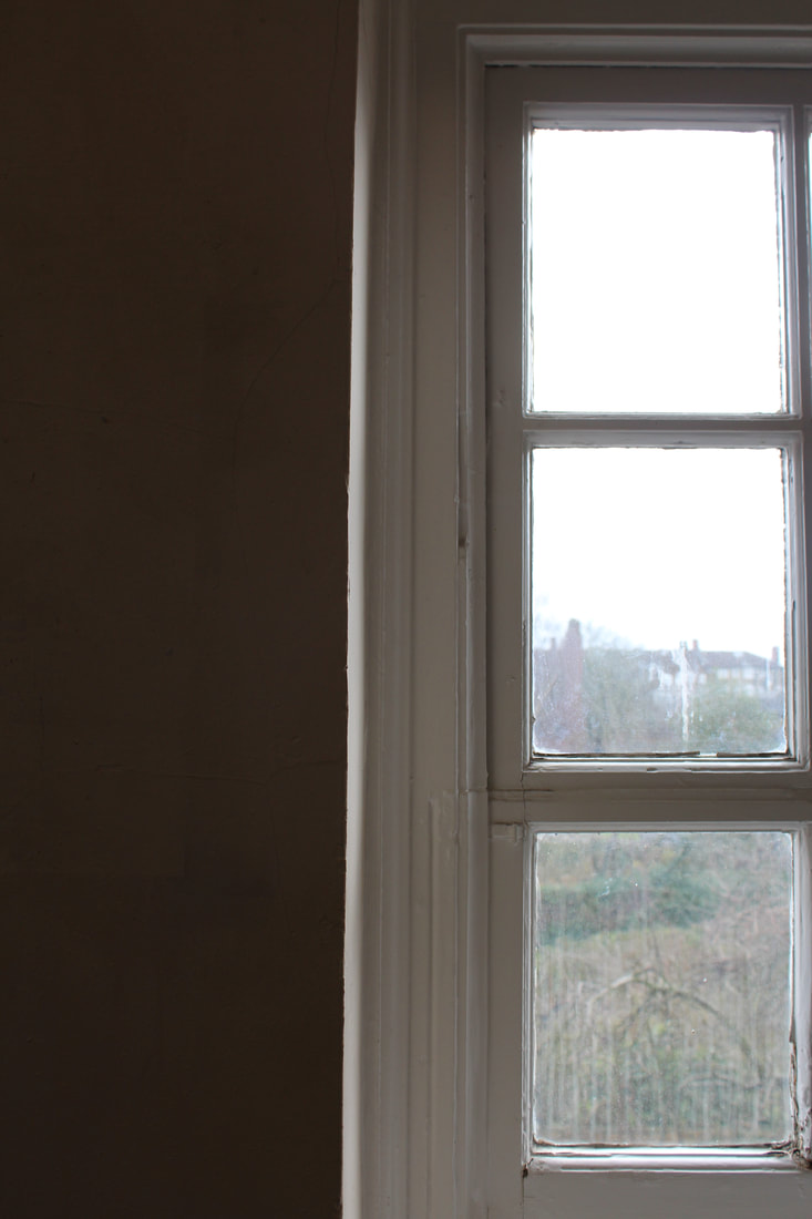
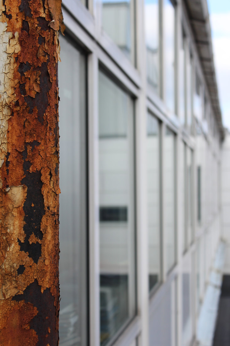
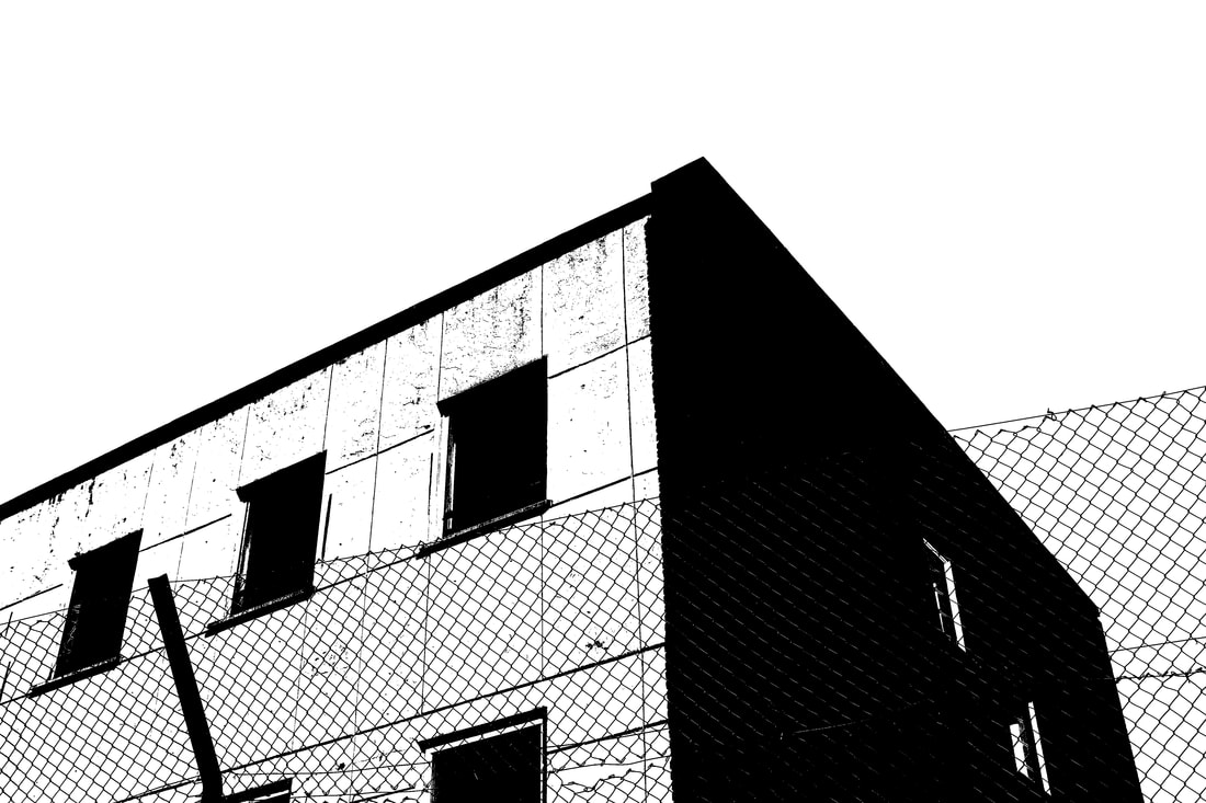
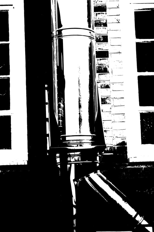
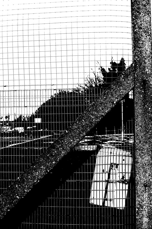
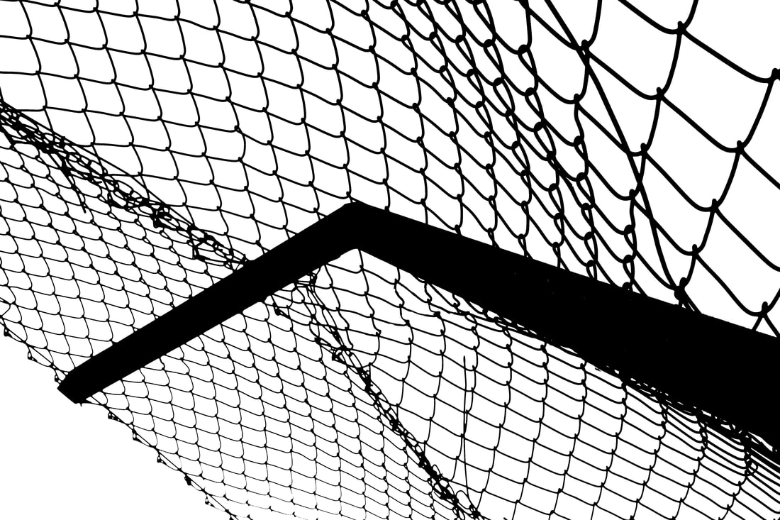
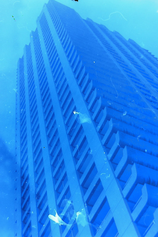
> The aim of this task was to take photographs through an obstructed space to limit what could be seen in the photograph. I photographed through objects such as keyholes, fences, windows, grates etc. I found that it was more effective to photograph through things where there was light on the other side to make the subject more visible - for example, the photographs that I took through grates and pipes were not as effective because it was dark on the other side. I also found that some of the frames became blurry as I photographed through them but this was effective because it made the subject on the other side the focal point of the photograph and added depth of field.
> If I were to develop this idea further, I could potentially think about finding frames that had more complex shapes as I found that most of my frames were circles. I could also experiment with using different backgrounds and finding different colours and textures with dark frames to create more depth and contrast.
> If I were to develop this idea further, I could potentially think about finding frames that had more complex shapes as I found that most of my frames were circles. I could also experiment with using different backgrounds and finding different colours and textures with dark frames to create more depth and contrast.
|
|
Chosen images:
|
|
|
|
|
Practical Tasks
|
|
> Using slow shutter speed
For the first task, I took photographs in class with a low shutter speed to create a sense of movement within the photograph. This created a sense of freedom in the composition because the low shutter speed captures the different movements of the subject, which is interesting because photographs can not capture moving images and is limited to only one frame, but the effect of low shutter speed creates the impression that the subject is moving within the photograph.
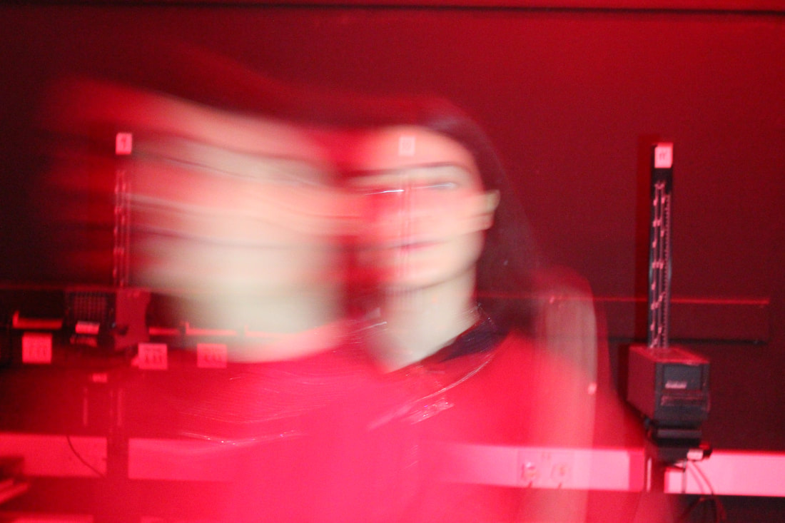
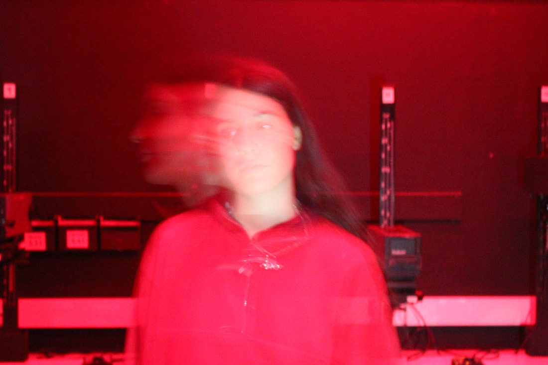
> For my first response, I took photographs in the red light of the dark room using a strobe light. The strobe light created an interesting effect because the subject was only illuminated when the light was on, so as the light flashed on and off the subject appeared in different places in the frame, which broke up the structure of the moving image. To improve this response, I could have asked the subject to move quickly from one position to another, instead of having the subject continuously moving.
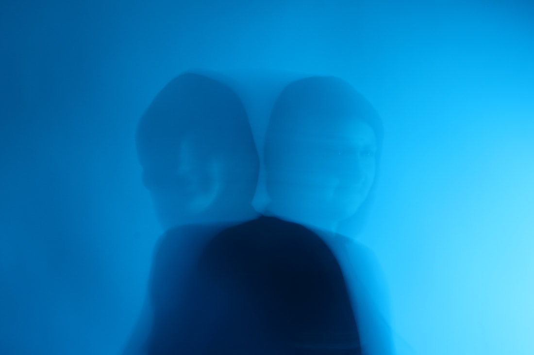
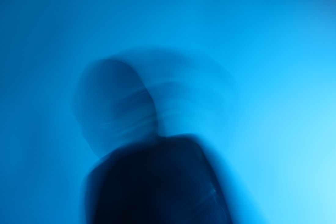
> For my second response I photographed through coloured transparent sheets in the light of the classroom. The coloured sheets and bright, consistent light of the classroom created a different effect to the photographs that I took in the dark room with the strobe light. I found that using the strobe light with red light in the background made the subject stand out more against the red background because the strobe light illuminated the subject with white light, whereas putting the blue sheet in front of the lens made the subject blend into the background more. With this response, I found it more effective to ask the subject not to move very much - changing position only once or twice in the shutter time so that the subject was more clear, whereas it was more effective to have the subject moving more when using the strobe light because the strobe illuminated the subject in different positions, and the more they moved, the further away the positions were from each other.
If I were to continue to develop this idea, I could experiment with using slightly different shutter speeds so that the subject is more/less blurred to create different types of movement in the composition. I could also use more than one coloured sheet over the lens or experiment with using the strobe light at different strobe speeds.
For the first task, I took photographs in class with a low shutter speed to create a sense of movement within the photograph. This created a sense of freedom in the composition because the low shutter speed captures the different movements of the subject, which is interesting because photographs can not capture moving images and is limited to only one frame, but the effect of low shutter speed creates the impression that the subject is moving within the photograph.
> For my first response, I took photographs in the red light of the dark room using a strobe light. The strobe light created an interesting effect because the subject was only illuminated when the light was on, so as the light flashed on and off the subject appeared in different places in the frame, which broke up the structure of the moving image. To improve this response, I could have asked the subject to move quickly from one position to another, instead of having the subject continuously moving.
> For my second response I photographed through coloured transparent sheets in the light of the classroom. The coloured sheets and bright, consistent light of the classroom created a different effect to the photographs that I took in the dark room with the strobe light. I found that using the strobe light with red light in the background made the subject stand out more against the red background because the strobe light illuminated the subject with white light, whereas putting the blue sheet in front of the lens made the subject blend into the background more. With this response, I found it more effective to ask the subject not to move very much - changing position only once or twice in the shutter time so that the subject was more clear, whereas it was more effective to have the subject moving more when using the strobe light because the strobe illuminated the subject in different positions, and the more they moved, the further away the positions were from each other.
If I were to continue to develop this idea, I could experiment with using slightly different shutter speeds so that the subject is more/less blurred to create different types of movement in the composition. I could also use more than one coloured sheet over the lens or experiment with using the strobe light at different strobe speeds.
1.
|
|
2.
|
|
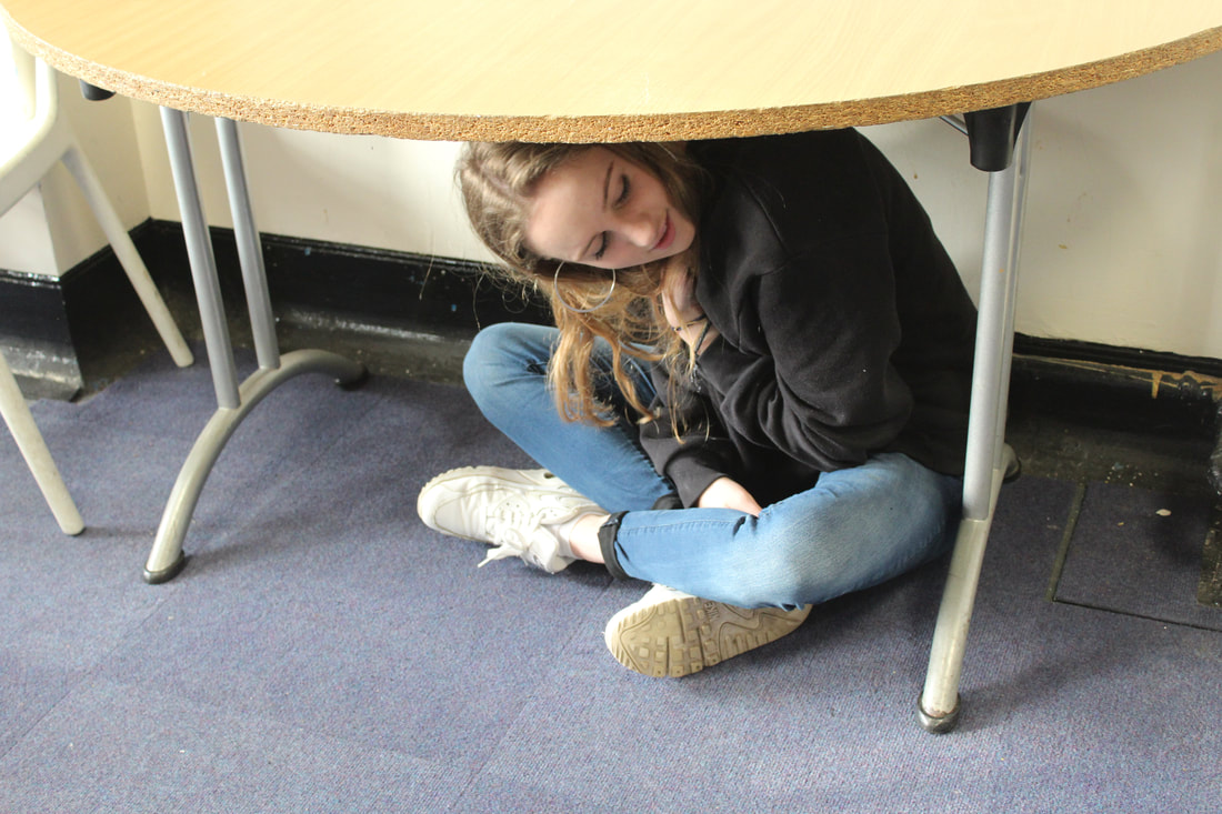
Task 2: LIMITING SPACE
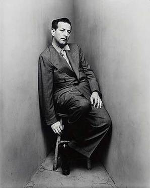
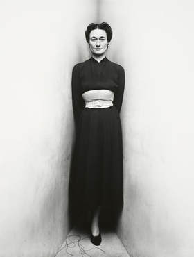
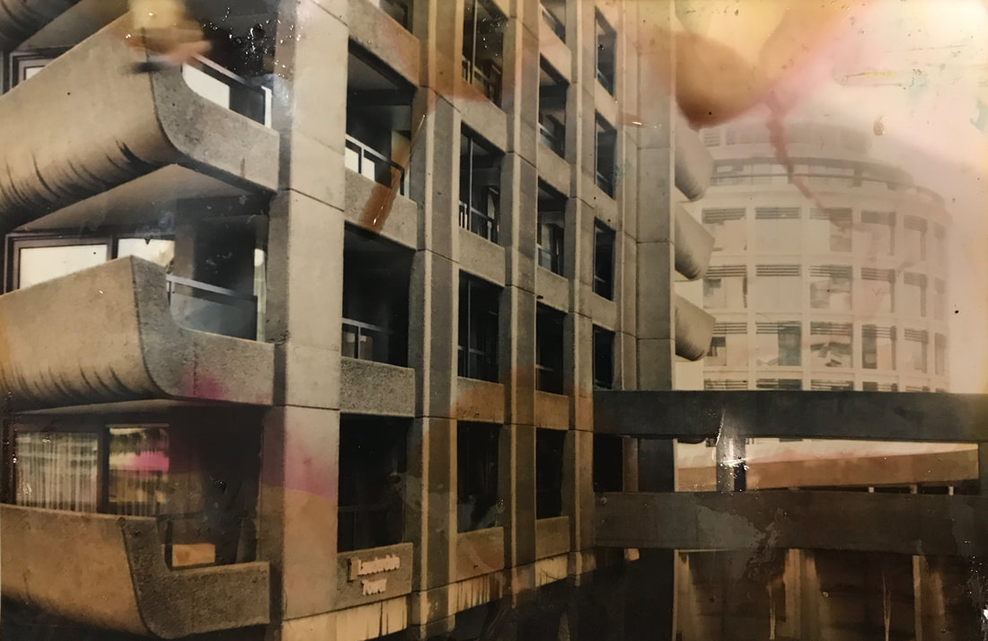
Response 1: Irving Penn
Irving Penn was one of the twentieth century's greatest photographers. At a time when photography was seen as a more practical process, Irving Penn introduced a more artistic and creative aspect to photography. In his series 'portraits in a corner', Penn took photographs of people positioned between two studio boards, either leaning against the boards or sitting in chairs, limiting the movement of the people in the photograph. The composition of these portraits is interesting because the way the boards are positioned makes it seem like the photographs expanding towards the edges of the composition, which brings forward the subject and creates depth as well as creating a sense of claustrophobia because the people are confined to the corner in the centre. Positioning the subject in the centre of the composition against the corner of the boards creates balance within the photograph and brings the person to the centre of attention.
Irving Penn was one of the twentieth century's greatest photographers. At a time when photography was seen as a more practical process, Irving Penn introduced a more artistic and creative aspect to photography. In his series 'portraits in a corner', Penn took photographs of people positioned between two studio boards, either leaning against the boards or sitting in chairs, limiting the movement of the people in the photograph. The composition of these portraits is interesting because the way the boards are positioned makes it seem like the photographs expanding towards the edges of the composition, which brings forward the subject and creates depth as well as creating a sense of claustrophobia because the people are confined to the corner in the centre. Positioning the subject in the centre of the composition against the corner of the boards creates balance within the photograph and brings the person to the centre of attention.
|
“The walls were a surface to lean on or push against. For me the picture possibilities were interesting; limiting the subjects movements seemed to relieve me of part of the problem of holding onto them.” |
|
|
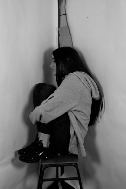
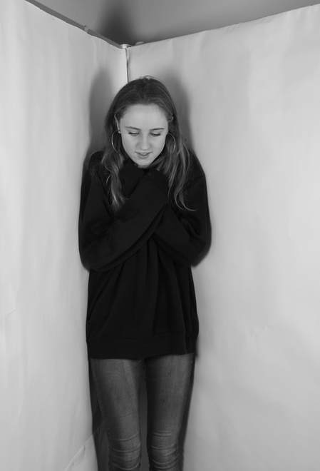
My response to Irving Penn
|
> For this task, I was required to take photographs in the same style as Irving Penn's 'portraits in a corner' series. I positioned two studio boards next to each other to make a corner, and photographed people sitting in a chair or leaning against the boards in the corner.
I noticed that Irving Penn positioned his subjects in quite award positions in his photographs, which suggested the idea that they were uncomfortable and tense, so I photographed people in uncomfortable positions to add to the claustrophobic atmosphere created by the tight corner. This links to the theme of freedom and limitation because the subjects are limited to one corner, which means that they can not move freely and comfortably. > As Irving Penn's photographs are in black and white, I made my photographs black and white, which I found was effective because it drew more attention to the subject and created more depth by accentuating the shadows and dark shapes in the centre of the composition as well as the angles of the boards drawing the viewers eye to the centre of the composition. > If I were to develop this idea, I could experiment with using different objects for the subjects to sit on. I could also potentially start to change the angles of the boards to create different shapes and limit the movement of the subjects in different ways or photograph the subjects in limited spaces around different areas. |
|
|
|
> whats next: After photographing people in the studio in response to Irving Penn's 'portraits in a corner' series, I am now going to develop this idea by photographing people in limited spaces around different areas.
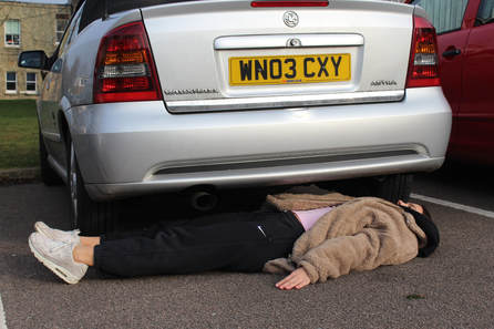
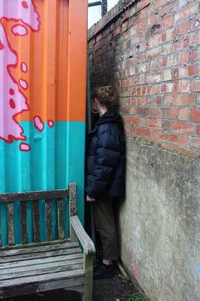
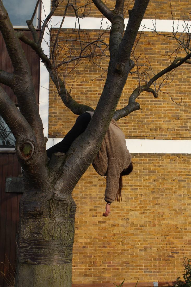
Developed response: Willi Dorner - Bodies in urban spaces
In his series 'Bodies in urban spaces', Willi Dorner has photographed dancers, climbers and performers in surreal positions around urban environments. The photographer was influenced by the idea of perception and how we perceive architecture, space and bodies. He wanted to explore the idea that people focus on visual perception such as balance and colour when looking at architecture. When photographing for this series, Dorner asked around about city hotspots and photographed in these places in cities around the World. He focused on buildings that were architecturally interesting or decaying, or small lanes or shortcuts hidden behind buildings that people would not usually notice and areas where you would not expect to see people. He did this because he wanted the residents of the city to "rediscover their own city again" by drawing attention to the area using people.
I found it interesting that the subjects are wearing brightly coloured clothes, which stops them from blending into the gaps that they are confined into, drawing peoples attention to the space and the architecture around them.
I found it interesting that the subjects are wearing brightly coloured clothes, which stops them from blending into the gaps that they are confined into, drawing peoples attention to the space and the architecture around them.
|
|
|
My response
|
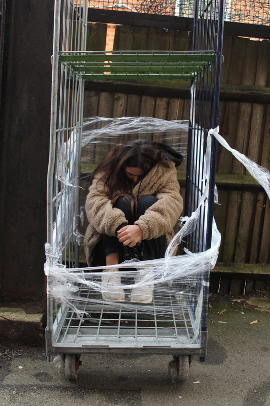
In response to Willi Dorner's 'Bodies in urban spaces', I positioned people in small spaces around the school area. I tried to choose abstract places to position people in to create a surreal image and draw peoples attention to places that people would not normally notice. I asked the people to sit, lie and stand in uncomfortable positions to create a surreal image. I think that my photographs were effective because I tried to reflect how he makes the subjects seem uncomfortable and out of place in the confined space to indicate limited movement If I was to develop this further, I could focus more on architecture and the space that I am positioning people in to draw the viewers attention to the area, as well as asking people to wear brightly coloured clothes. |
|
|
|
|
|
|
My photograph After comparing my photograph with the Photographer's, I noticed that the person in Dorner's photograph is stiff and rigid in the tree where as my subject is hanging from the branches. I could think about developing this further and experimenting with different positions to see whether having a more rigid structure is more effective.

|
Willi Dorner's photograph 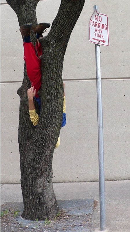
|
|
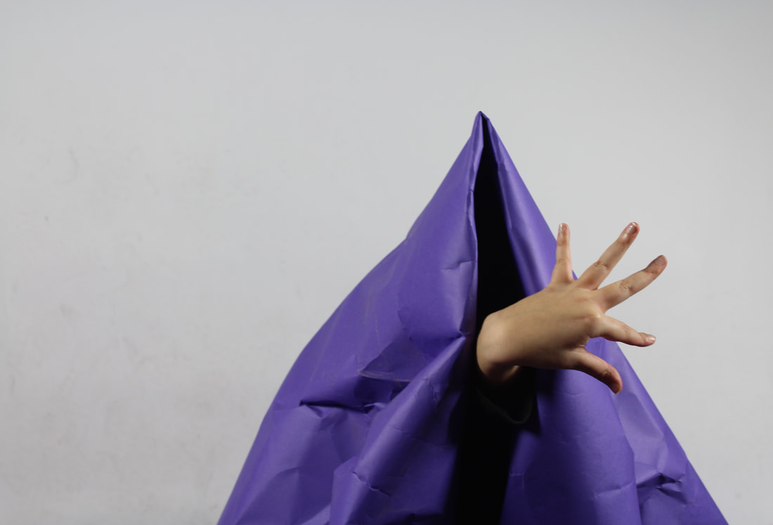
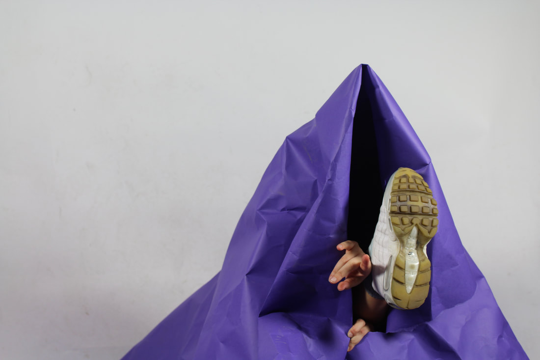
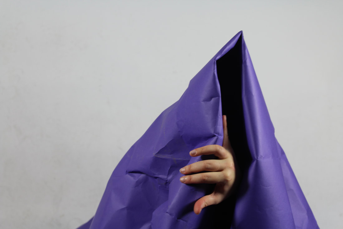
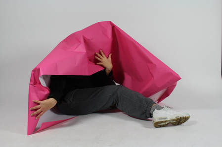
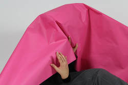
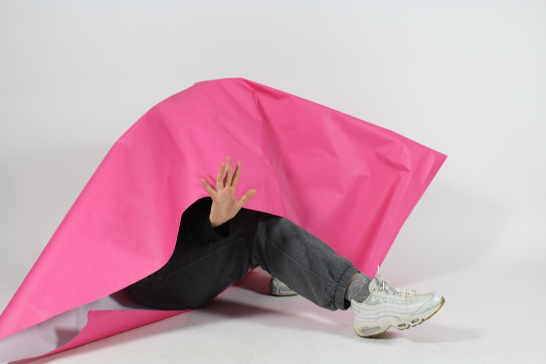
Response 3: Using paper to limit what is shown in the photograph. Continuing from my research on Willi Dorner and Irving Penn, I experimented with using paper to limit space in the studio. I used large sheets of paper to obscure the subject, asking them to show different body parts each time. This created a surreal image because it makes the body parts seem separated from the main body and limits what can be seen of the body in the photograph. If I was to develop this idea, I could experiment with having more than one person obscured by the paper at the same time, so for example 4 hands could be seen, which would create an abstract and surreal image and allowing the bodies to make different shapes. |
|
|
|
|
|
|
|
Task 3: Pushing the limits of photography
Response 1: Focus
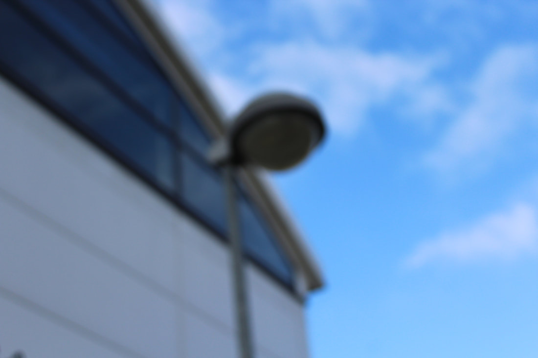
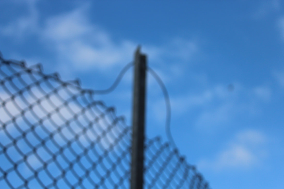
To experiment with the physical limitations of photography, I took photographs of objects inside and outside of the school, making sure that the camera was on manual focus. This task was interesting because blurred photographs are often seen as a mistake, but taking intentionally out-of-focus pictures allowed me to experiment with what techniques and objects worked best in this way. I found that small, intricate objects were not as effective as bigger shapes because they all blurred together. Taking the photograph out of focus limited the amount of detail seen in the photograph, but created a sense of freedom at the same time because it allows the viewer to imagine the details in the objects.
To experiment with the physical limitations of photography, I took photographs of objects inside and outside of the school, making sure that the camera was on manual focus. This task was interesting because blurred photographs are often seen as a mistake, but taking intentionally out-of-focus pictures allowed me to experiment with what techniques and objects worked best in this way. I found that small, intricate objects were not as effective as bigger shapes because they all blurred together. Taking the photograph out of focus limited the amount of detail seen in the photograph, but created a sense of freedom at the same time because it allows the viewer to imagine the details in the objects.
|
|
|
|
Response 2: Composition
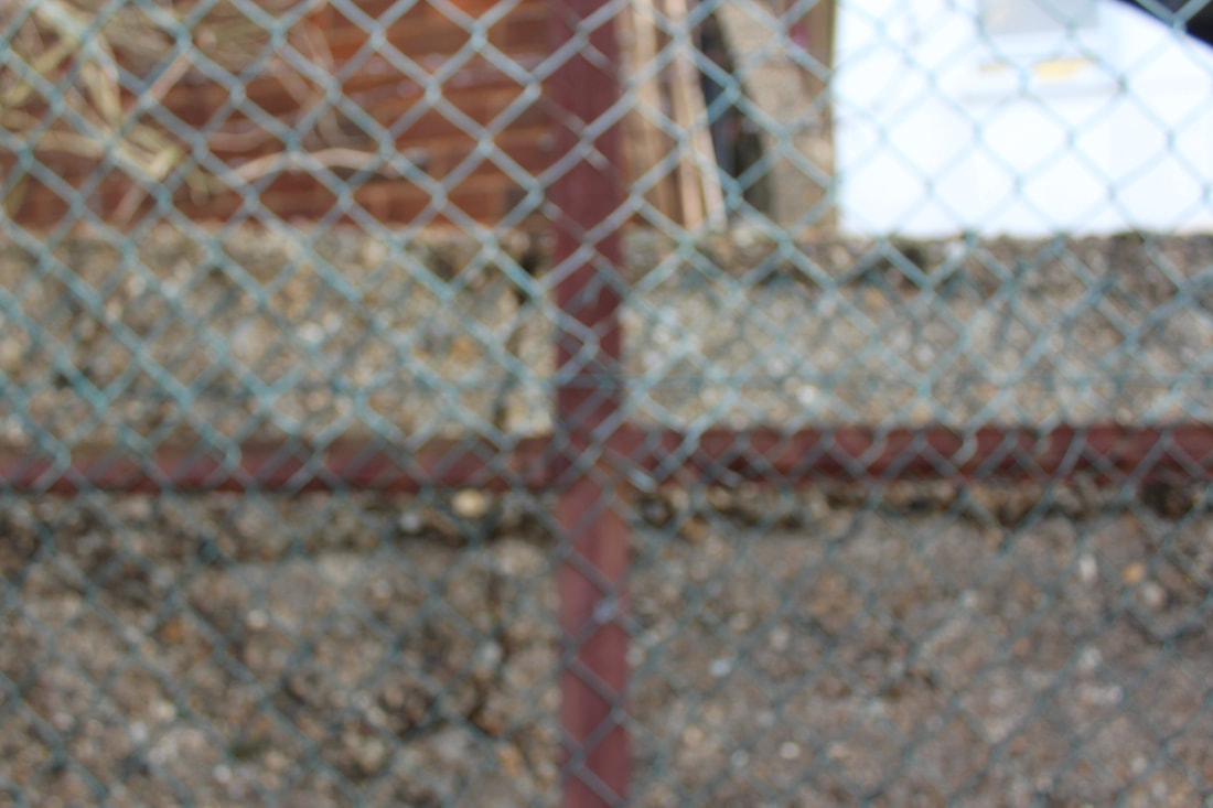
In this task I was required to select compositions that had the main subject of the photograph in the periphery of the frame to limit what the viewer sees of the main subject. I photographed subjects inside and outside of the school to experiment with how the frame of the photograph can limit what the viewer sees. I found it most effective to have an object that continues outside the frame of the photograph, such as the edge of a window or fence. This creates an abstract image because the subject of the photograph is normally at the centre of the image, and limiting how much of the subject can be seen in the photograph makes the viewer wonder what the rest of the subject looks like.
|
|
|
|
Task 4: Damage
For this task, I used a range of different media and techniques to explore how paint, bleach, thread etc can be used to create freedom and limitation in printed photographs by obscuring or adding to parts of the photograph.
Painting with acrylic paint
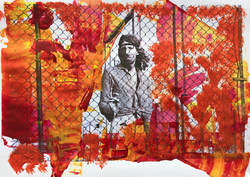
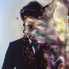
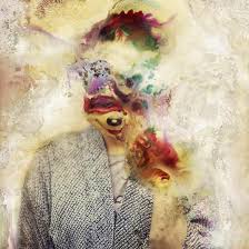
I used acrylic paint to limit what was shown in this photograph. I left only the person visible in the image to remove the context, which I found effective because it limits the amount of the photograph that can be seen by the viewer. I used red, orange and yellow paint to contrast with the blank black and white image, which draws more attention to the person in the centre of the photograph because he is the only thing in the photograph that is not covered in paint.
I used acrylic paint to limit what was shown in this photograph. I left only the person visible in the image to remove the context, which I found effective because it limits the amount of the photograph that can be seen by the viewer. I used red, orange and yellow paint to contrast with the blank black and white image, which draws more attention to the person in the centre of the photograph because he is the only thing in the photograph that is not covered in paint.
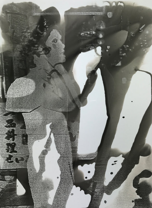
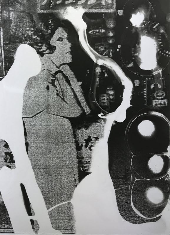
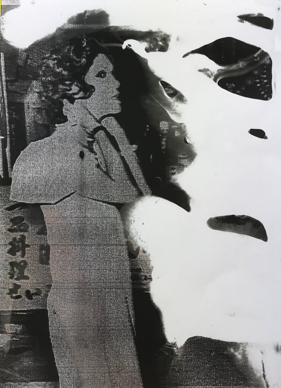
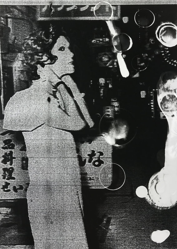
Painting Developer
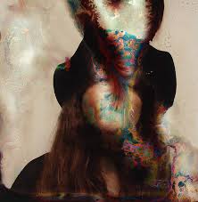
To create this image, the photograph was first photocopied onto acetate. I then exposed the image and painted on developer,making sure to cover only certain parts of the image, so some of it was left blank. Painting developer onto the photograph meant that I could choose what sections of the photograph were shown, so I tried to make the woman in the photograph the most visible, with the rest of the photograph only partly shown, limiting what the viewer could see of the image and taking away the context.
To create this image, the photograph was first photocopied onto acetate. I then exposed the image and painted on developer,making sure to cover only certain parts of the image, so some of it was left blank. Painting developer onto the photograph meant that I could choose what sections of the photograph were shown, so I tried to make the woman in the photograph the most visible, with the rest of the photograph only partly shown, limiting what the viewer could see of the image and taking away the context.
|
|
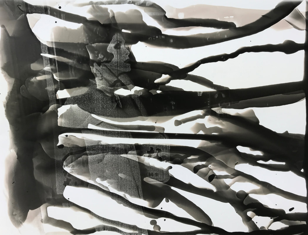
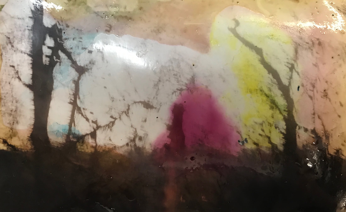
Painting bleach
To manipulate these photographs, they were first photocopied onto acetate and then developed in the dark room. I then used bleach to limit what the viewer can see in the photograph. I like the effect of the bleach because it completely removes the part of the image that it is exposed to, giving the viewer the freedom to wonder what the context of the photograph is, as only the person in the photograph is visible. I also like how the bleach creates a burned effect on the image.
|
|
|
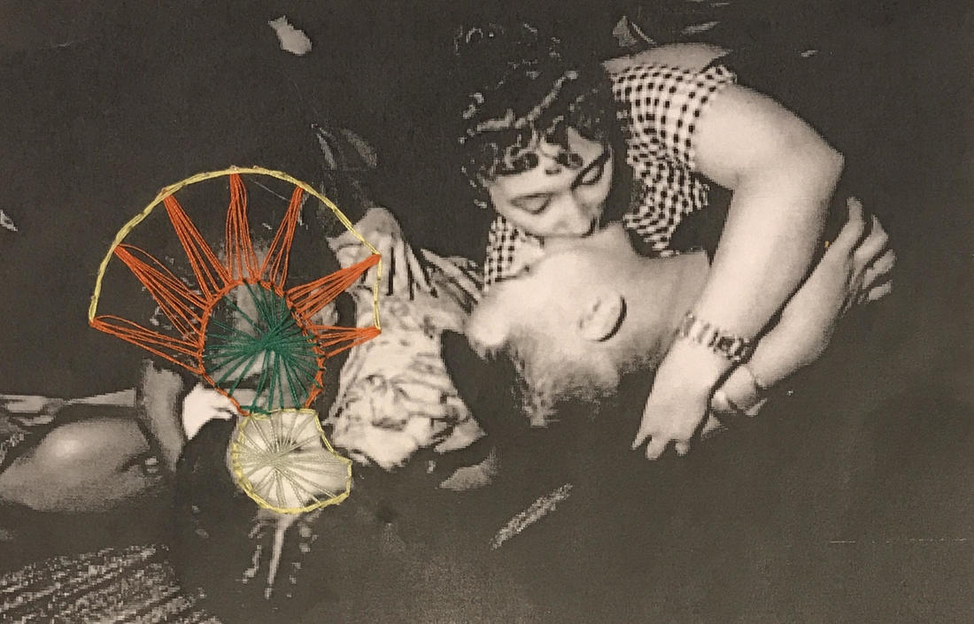
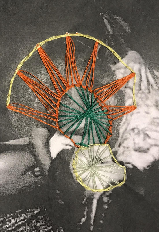
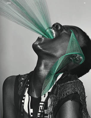
Stitching into the photograph
this technique was interesting because the thread limits what you can see in the photograph by covering the peoples faces, but also relates to freedom because of the patterns of thread - Maurizio Anzeri gives an 'aura' / a personality to the people in the photographs he sews into - he has the freedom to chose how he edits the photo and to choose the people's personalities, and I tried to reflect this when sewing into the photographs by sewing over people's faces with an interesting an expressive pattern.
|
|
Artist link to stitching into photographs: Maurizio Anzeri
|
Maurizio Anzeri created his series by collecting vintage photographs and sewing directly into them. The embroidered patterns look like costumes, but also suggest a psychological aura which seems to reveal the person's thoughts or feelings. I find this interesting because the photographer does not know the people in the photographs, but by sewing onto them, it gives the people within the photo a personality. The majority of the photos he uses are black and white, and he uses brightly coloured thread which creates contrast between the people and the thread and makes the patterns of the thread stand out against the image behind. I find Maurizio Anzeri's work interesting because he adds the structure of things that aren't usually visible and showing something something that is not physical- he is portraying psychological 'auras' by sewing over photographs of people using brightly coloured thread.
|
|
Task 5: Black Light
Photographer: Keld Helmer-Peterson
Keld Helmer-Petersen had an experimental and abstract approach to photography. He worked on the borders of traditional photography, often working with cameraless photography to create photograms, pushing the limits of how photography was normally perceived. In his series 'Black Light', the Helmer-Petersen experimented with digital photography, using black and white negatives of objects that he had found, for example insects, wires, refuse etc on a scanner. His work links to freedom and limitation because he pushed the limits of photography to create abstract images that have simple yet complex shapes and patterns. In most of his 'Black Light' photographs, it is difficult to tell what the subject of the image is, which is interesting because they are often not everyday objects that most people are familiar with, but he has photographed them in a way that makes them surreal and interesting.
|
|
My response
|
In response to Keld Helmer-Peterson's series 'Black Light', I photographed every-day objects and landscapes on my digital camera. I then used photoshop to reflect the effect achieved in the photographers images. I adjusted the threshold of the photographs to remove the colour and background of the photograph to create a simplified and surreal effect. If I was t develop this further I could use smaller objects such as pins, insects etc to make the object less recognisable when the threshold is adjusted - my photographs were of things such as buildings and fences which were still distinguishable when edited.
|
|
|
|
|
Chosen images:
|
|
3 strands:
1. Damaged film
2. limits of society
3. water
Strand 1 - Damaged film
Brandon Seidler
In his series 'impure', photographer Brandon Siedler takes photographs of sites that have been contaminated by pollutants and chemicals, and then puts the photographs in a film soup of the same chemicals that have damaged the site. He explores how beauty can be found in imperfection, and this idea is reflected in the beautiful patterns and colours that are created by the chemicals.
The inspiration for this series came while the photographer was researching chemicals and experimenting with film processes for a photography class, and learned about a toxic spill that had happened nearby. He then started to research and visit different locations that had been affected by chemical pollutants, and was surprised to find that there were visual effects of pollution almost everywhere he looked. Seidler first shoots the photographs on film, then creates a film soup to damage the negatives. What makes the images especially powerful is that they show the visible effects of the pollutants that you would not normally see in the area, making the viewer think about the fact that if the chemicals can destroy the plastic film, what could it be doing to the fragile environment. Because the chemicals are difficult to get hold of, the photographer often uses similar chemicals that have the same effect, using household items such as Drano, paint thinner hydrogen peroxide, creating interesting colours and textures. Seidler says that 'we tend to forget about the harm we are doing [to the environment] or we try not to think about it' - showing how his intention for this series is to raise awareness about how humans are damaging the environment with pollutants.
The inspiration for this series came while the photographer was researching chemicals and experimenting with film processes for a photography class, and learned about a toxic spill that had happened nearby. He then started to research and visit different locations that had been affected by chemical pollutants, and was surprised to find that there were visual effects of pollution almost everywhere he looked. Seidler first shoots the photographs on film, then creates a film soup to damage the negatives. What makes the images especially powerful is that they show the visible effects of the pollutants that you would not normally see in the area, making the viewer think about the fact that if the chemicals can destroy the plastic film, what could it be doing to the fragile environment. Because the chemicals are difficult to get hold of, the photographer often uses similar chemicals that have the same effect, using household items such as Drano, paint thinner hydrogen peroxide, creating interesting colours and textures. Seidler says that 'we tend to forget about the harm we are doing [to the environment] or we try not to think about it' - showing how his intention for this series is to raise awareness about how humans are damaging the environment with pollutants.
|
|
|
Seung Hwan Oh
|
|
|
My response
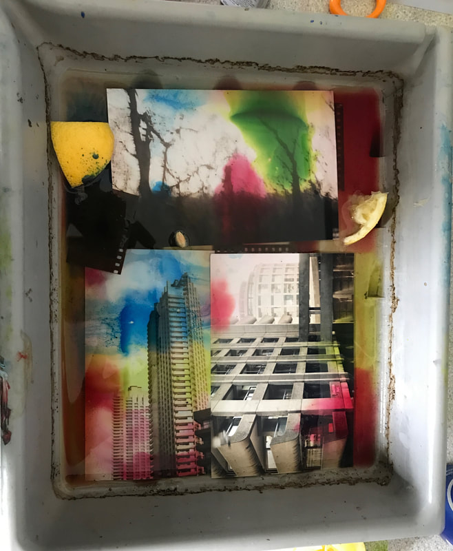
In response to Brandon Seidler and Seung Hwan Oh, I have put some of my developed film photographs and negatives in a variety of different 'film soups' to see how the different substances affect the photographs over two days. I used lemons, food dye, energy drink, whiskey, soy sauce, water and honey in different combinations.
|
1. Film negatives in energy drink
2. Film negatives in Jack Daniels whiskey 3. Film negatives in lemon juice, food dye and water 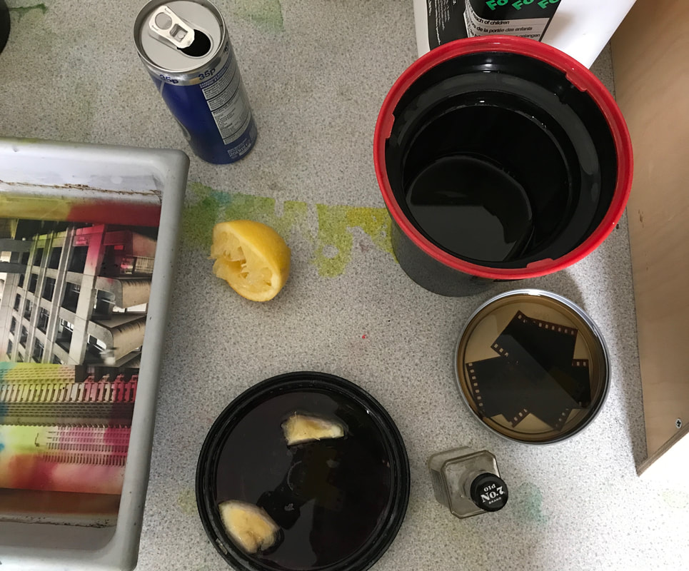
|
4. Developed photographs and film negatives in energy drink, food dye and lemon
|
|
5. Developed film photographs in soy sauce, water and honey 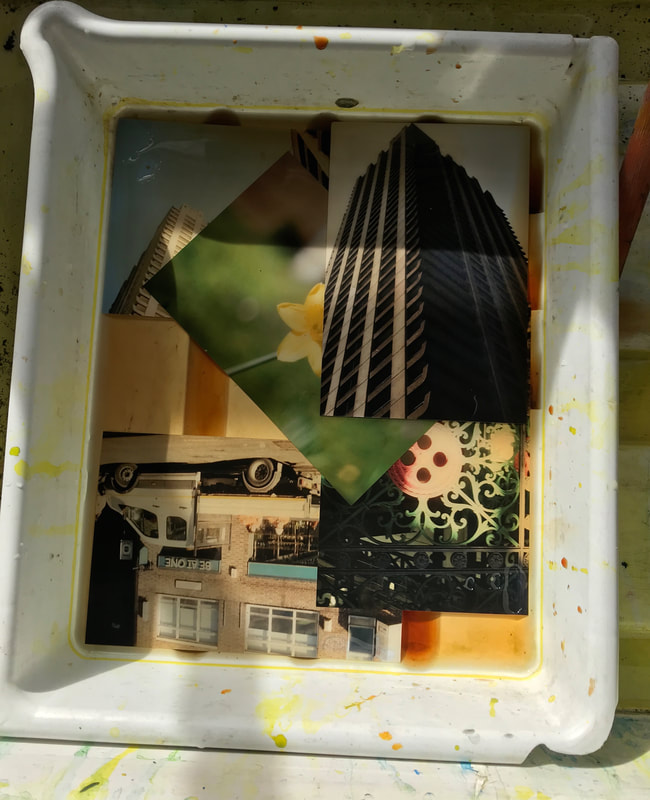
|
6. Developed film photographs in water and lemon 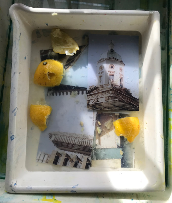
|
Results
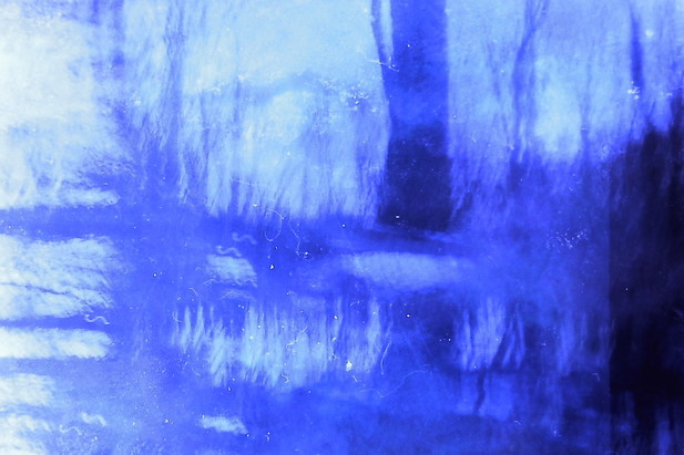
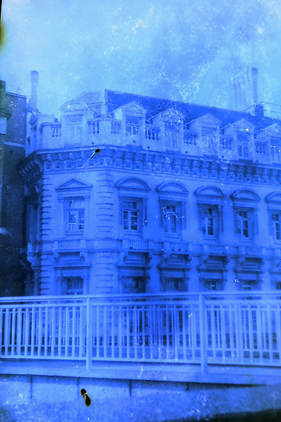
Unfortunately, (apart from the energy drink, food dye and lemon) the developed photographs/negatives that I put in the 3 trays with different combinations of lemon, food colouring, soy sauce, honey and energy drink did not work, but the trays with negatives in whiskey and energy drink alone were successful, so I scanned them in the negative scanner.
Whiskey
|
|
|
|
|
Comparing photographs
|
Picture of the building that I took on my digital camera 
|
Damaged film photograph 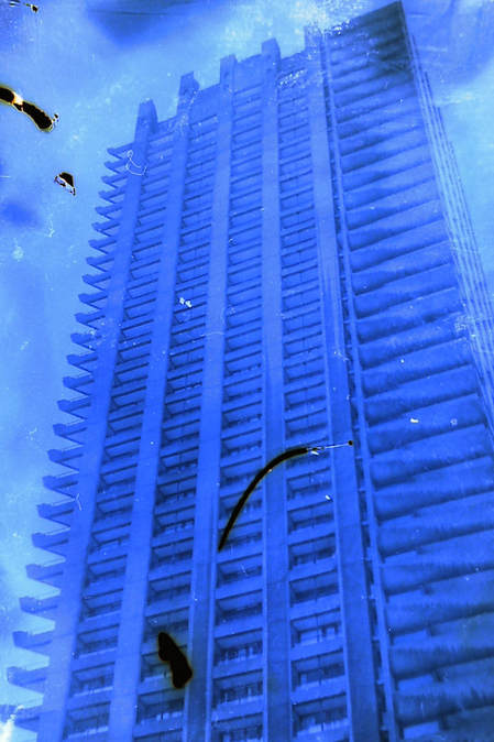
|
Energy drink
|
|
|
|
|
energy drink, food dye and lemon
|
|
|
I found that the most effective film soup was either:
1. Energy drink, food dye and lemon
2. energy drink
These were the most effective because the photographs came out as if they had decayed, and some of the colours had started to bleed into each other, creating an abstract effect. If I was to develop this strand further, I could think about using different combinations of film soup and try damaging the film before shooting to see if it had a different effect. I could also consider the location of the photographs to respond to Brandon Seidler, who damages his film with the chemicals that physically damage the area to visually represent the effects of pollution and harmful chemicals to the environment.
Strand 2 - freedom and limitation of society
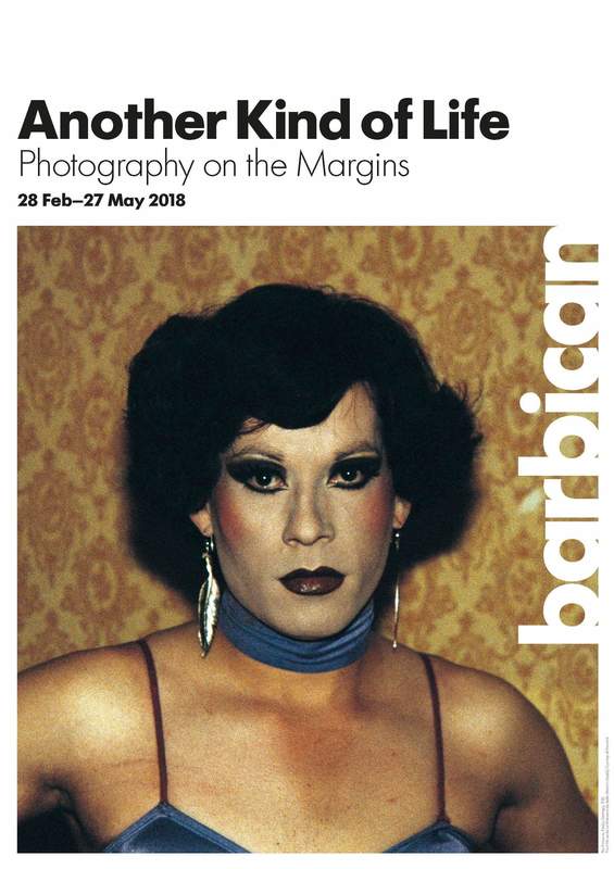
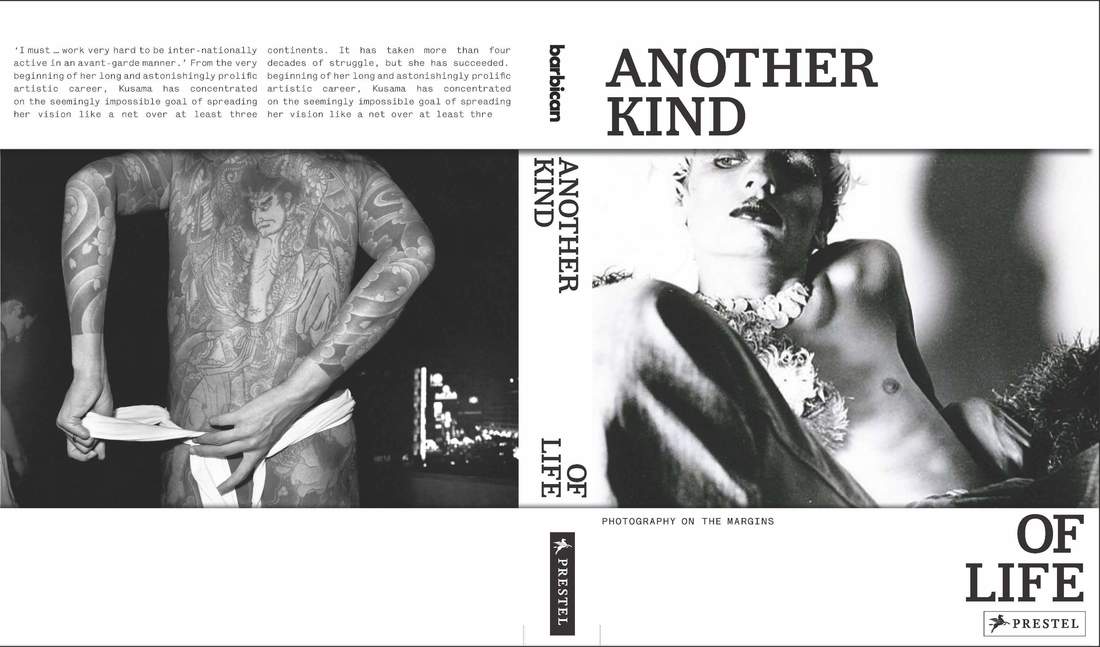
Gallery visit: another kind of life
Presenting work by photographers from the 1950's to 2017, 'another kind of life' explores communities living on the margins of society from America to India, Chile and Nigeria. The exhibition provides insight to an unseen and complex side of the world, documented by photographers who often immerse themselves in the communities for long periods of time in order to experience the way they live as well as photographing the people living in these communities.
|
|
Jim Goldberg - Raised by wolves
One of the photographer included in the Barbican's exhibition 'Another Kind of Life' is Jim Goldberg, who is an American photographer who documents long-term, intimate collaborations with neglected, disregarded populations that live 'on the margins of society'. In his series 'Raised by Wolves', Goldberg spent around ten years documenting the lives of homeless teenagers living on the streets of San Fransisco and Los Angeles, creating a scrapbook of interviews (with the teenagers, social workers, police and parents), video stills, belongings and handwritten statements that give the viewer a glimpse of the hash and unsparing reality of being a teenager without a home.
In 'Raised by Wolves', the photographer focuses on two teenagers, Dave and Echo. The book starts with Echo's story, including a conversation with her mother, Echo’s handwritten testimonial, a map, and a school portrait, allowing the viewer to get an insight to her life before she left home.
What makes Goldberg's work stand out from other photographers is that he asks the teenagers to write their own statements about how they feel about living on the streets, which allows the viewer to get a more personal view of each individual, instead of being filtered through the photographers editing. The series also includes interviews between the teenagers and the photographer, showing how Goldberg was involved with them and how open they are with him.
First response
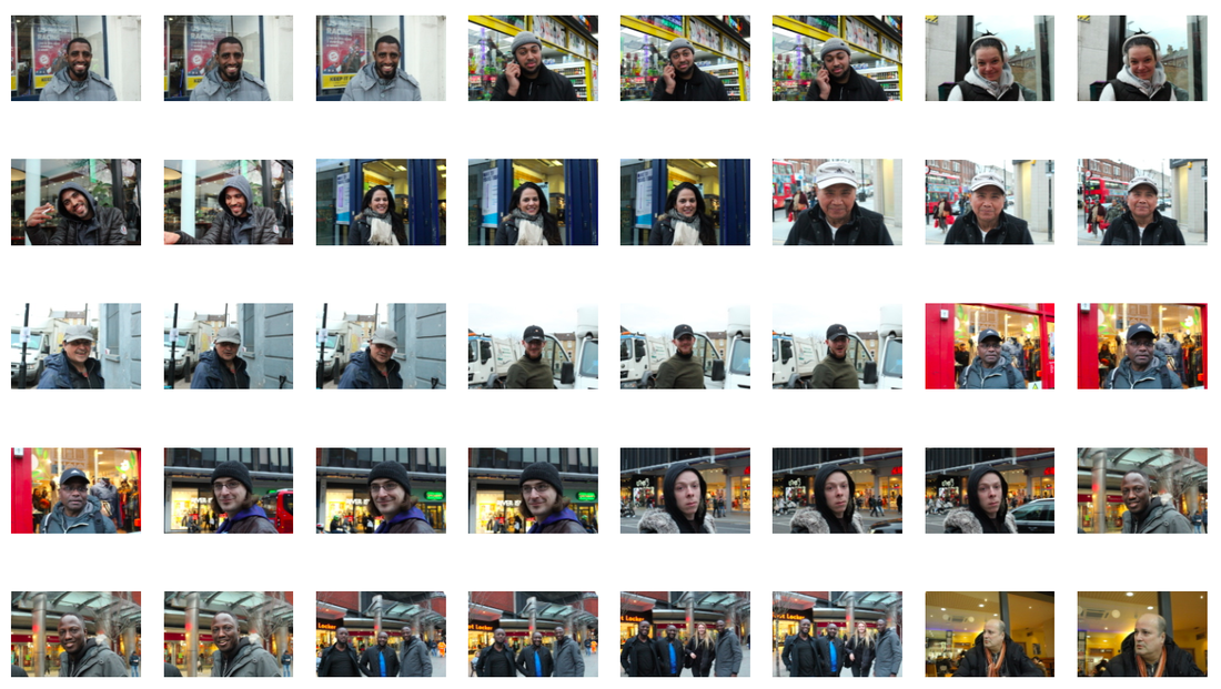
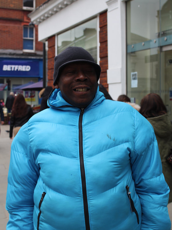
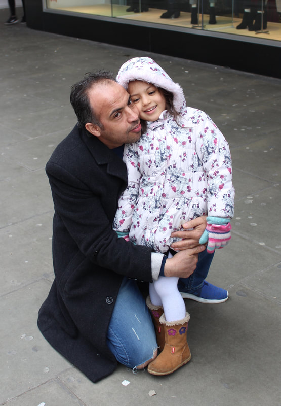
In response to Jim Golberg's series, I decided to experiment with the freedom and limitation associated with poverty in different areas of London. I was originally planning to photograph and talk to homeless people, but I found that many people did not want to be photographed and I found it more effective to explore an area and the people living there. I photographed the area around Turnpike Lane and Wood green to explore the freedoms and limitations presented by different social situations. I wanted to photograph portraits of people in this area to explore the idea of how people are potentially limited by the area that they live in or the social situation that they are brought up in. I made sure to notice the job or activity these people were doing as I photographed as I believe this could reflect the freedoms and limitations presented by an area or social situation. If I were to develop this idea, I could think about asking the people to talk about their occupation or their feelings on social hierarchy in London and how it may benefit or restrict them in different ways. I could also consider photographing shops in the area as well as people to get a wider understanding of how the area may contrast with another, more wealthy area.
|

|
Second response
|
Continuing from my previous response on the freedom and limitations presented by different social situations and areas, I revisited Wood Green and Turnpike Lane to photograph the shops and stalls in that area to explore how this area might have different shops, restaurants etc to another, more wealthy area. I found that there were many big chain shop in the Mall in Turnpike Lane such as New Look and Primark, but as I walked further from the mall I found that there was a more diverse range of shops and markets that may not be seen in an area such as Muswell Hill or Highgate. This shows that people living in this area may be limited to a certain type of shop and have to travel to a different area to access shops that are in predominantly more wealthy areas. If I was to develop this idea further I could photograph a more wealthy area and compare the shops and people in the two contrasting areas.
|
|
|
|
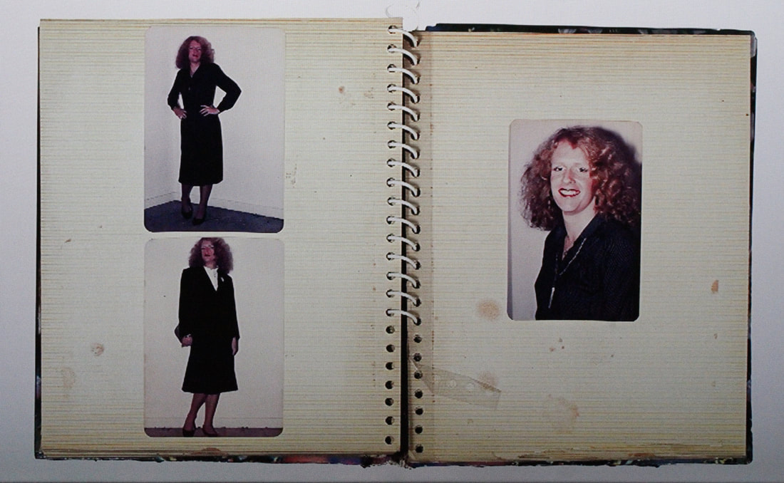
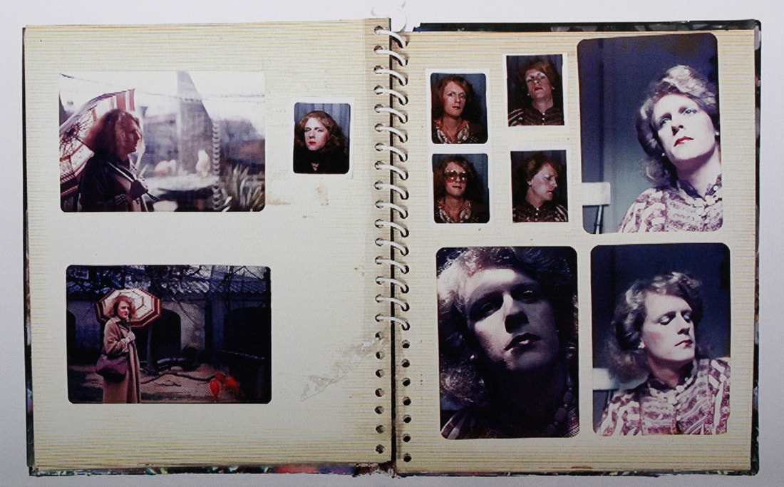
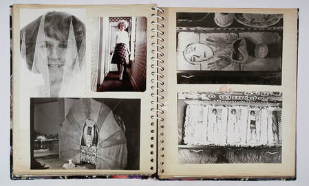
Gallery visit: Grayson Perry
Grayson Perry was born in 1960 and is a British contemporary artist. This exhibition was centred around a private photo album belonging to the Grayson Perry, dating from his early 20's. The photographs in the album give the viewer an insight into Grayson Perry's alter ego, 'Claire'. Cross dressing became a part or Perry's Life throughout his childhood and teenage years, especially while he attended Portsmouth art school, where he was in a supportive environment and felt free to explore and express his identity.
The album shown in this exhibition is a personal album of 'family' photographs of Grayson Perry's alter ego, Claire. He calls this his family photo album, because he does not own a family photo album of his own, as "unhappy families don't take photos". Perry's work relates to the theme of freedom and limitation because he felt restricted by his family and society for most of his childhood, but found confidence and freedom to express his alter ego as he found more support. I find this concept interesting because many people do not have the freedom to express themselves because of lack of support from friends and family as well as pressure from society, and photographers such as Grayson Perry show that self-expression can be something beautiful and powerful.
The album shown in this exhibition is a personal album of 'family' photographs of Grayson Perry's alter ego, Claire. He calls this his family photo album, because he does not own a family photo album of his own, as "unhappy families don't take photos". Perry's work relates to the theme of freedom and limitation because he felt restricted by his family and society for most of his childhood, but found confidence and freedom to express his alter ego as he found more support. I find this concept interesting because many people do not have the freedom to express themselves because of lack of support from friends and family as well as pressure from society, and photographers such as Grayson Perry show that self-expression can be something beautiful and powerful.
|
|
|
|
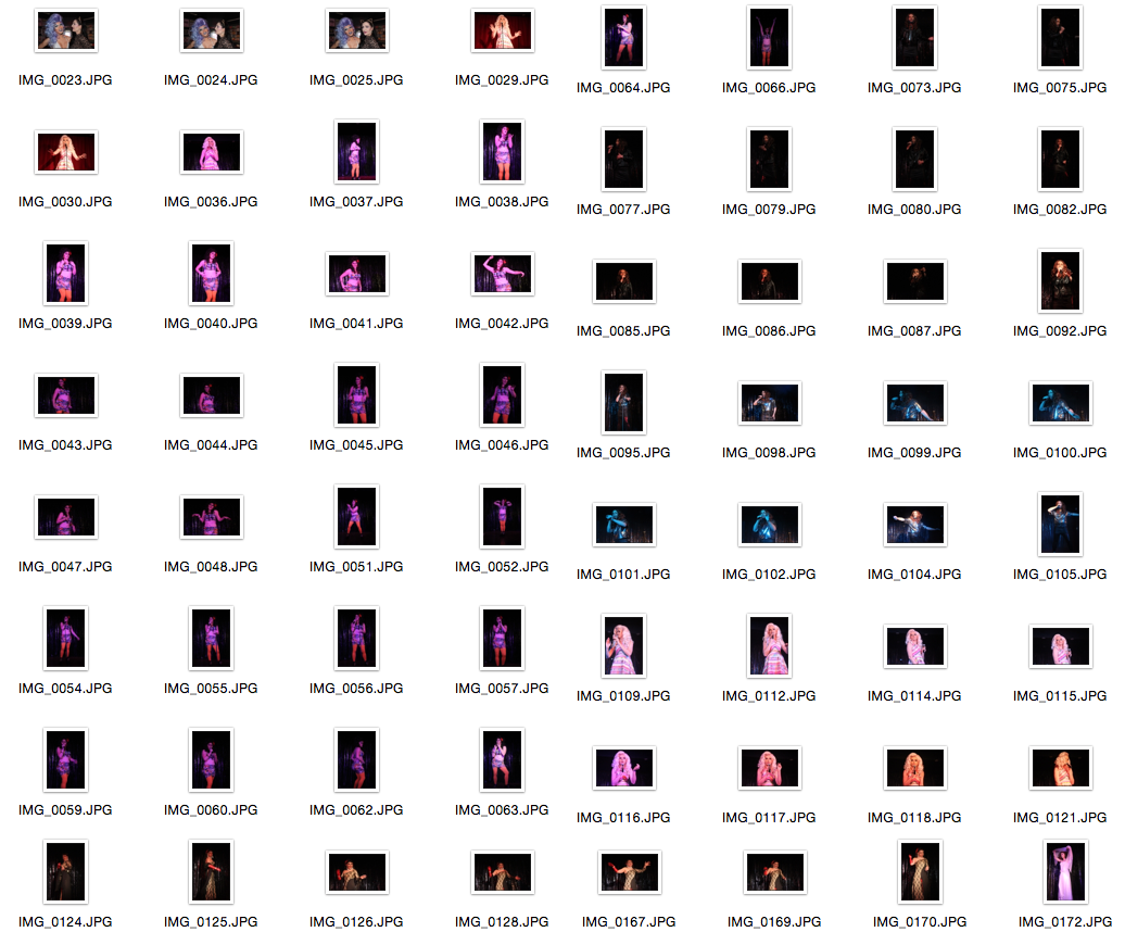
My response to Grayson Perry
In response to Grayson Perry, I photographed at a drag show to explore the theme of freedom and limitation presented by society. I photographed a graduation show for people on a drag queen course, which was interesting because it allowed me to gain insight on how people express themselves in different ways. The drag show related to Grayson Perry's work because it shows how people can find the freedom to express themselves when supported by a positive atmosphere when they may feel pressured by society on a daily basis. The show created an atmosphere of freedom and acceptance because the drag queens were getting positive attention from the people watching the show and some of the graduating drag queens had invited their friends and family to watch and support them.
If I was to develop this idea further, I could think about interviewing the drag queens about how whether they feel conformed by society and whether they find that they have a supportive environment to express themselves freely.
If I was to develop this idea further, I could think about interviewing the drag queens about how whether they feel conformed by society and whether they find that they have a supportive environment to express themselves freely.
|
|
|
|
|
|
|
|
|
|
|
|
|
|
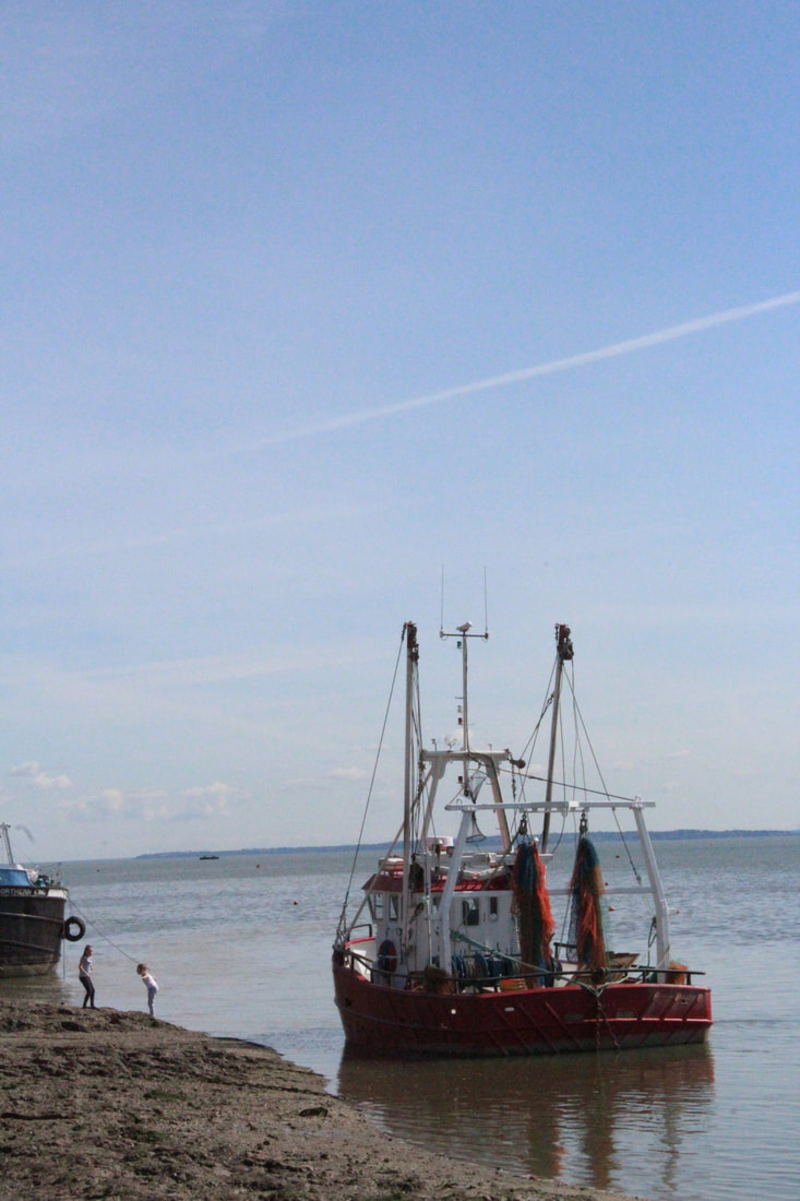
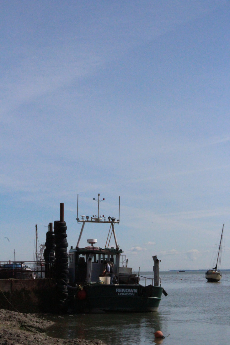
Strand 3: water - CHOSEN STRAND
Nadav Kander: Dark Line - The Thames Estuary
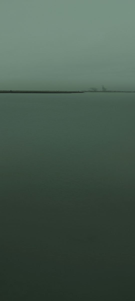
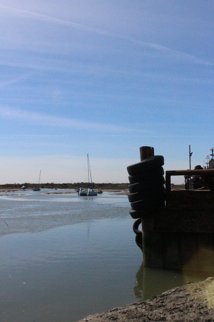
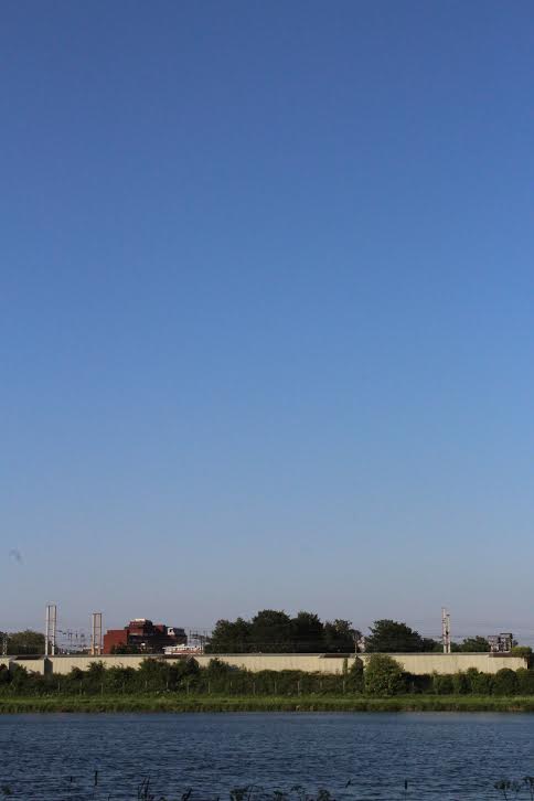
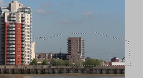
In his series 'Dark Line', Nadav Kander photographs the Thames Estuary in the South East of England. Kander was drawn to the sense of concealment and isolation in this series, and he decided to photograph the thames estuary because of its hostile and desolate nature - the area can not be built on because of quicksand so the area is empty and derelict. The photographer was also interested in the history of the Thames Estuary - the river was once the busiest trading route in the World, and Kander's photographs of turbulent water and heavy grey skies represent the mysterious history of the river. He visited the Estuary in different places over a period of more than two years, focusing on areas with historical value such as disused artillery forts and quarries.
The composition of the photograph is interesting because it is unbalanced - the photograph is usually split into 3 sections with the sky taking up the majority of the image. This makes the photograph seem heavy and weighed down towards the bottom, where the lower section is taken up by the water with a structure splitting the two sections. The sky and water are similar colours, but there is a contrast created between them because the water is rough and turbulent and the sky is calm.
the way that the exhibition is curated reflects the proportions of human body, creating contrast between the body of water and the body of the viewer. The photographs are hung low on the wall so that it stretches from the feet to the height of the viewer, which draws the viewer to the image and immerses the viewer in the photograph. The photographer uses colour and composition to create a mysterious and inhospitable atmosphere, with the large blank sky weighing down the photograph and the dark water creating a sense of mystery and alluding to the history of the river.
Nadav Kander's 'Dark line' series relates to the theme of freedom and limitation because the movement of the water is restricted in the frame of the photograph, but in some of Kander's photographs, a slow shutter speed has been used so that the turbulent waves are slightly blurred, creating a feeling of movement. This links to the ideas I had in my 'slow shutter speed' set task where I created freedom in the photographs by using a slow shutter speed to create movement.
Talk by Nadav Kander
Nadav Kander visited our school to talk about his work, and I was especially interested in his explanation of his 'Dark Line' series, as it related to my research on his series about the Thames Estuary, and it was interesting to hear first-hand about how he created his photographs and why he decided to choose this location.
- more interested in the historical aspect of the river - it is quite boring geographically
- beauty from melancholy and impact of humans on nature.
- wanted to make it different to his Yangtze series - less about documentary and more about the history.
- wanted to create a melancholy and isolated atmosphere by editing the colours of the photographs
- Kander explained that he is interested in exploring isolated and derelict areas to create a mysterious and desolate atmosphere.
|
|
|
|
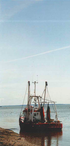
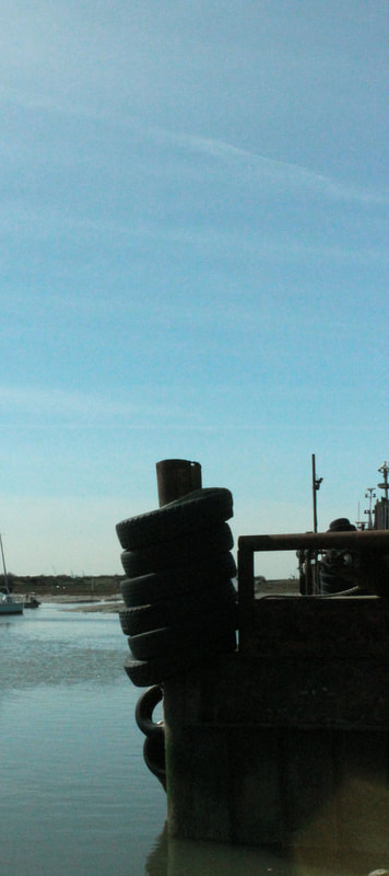
Response 1: Haringey Estuary
|
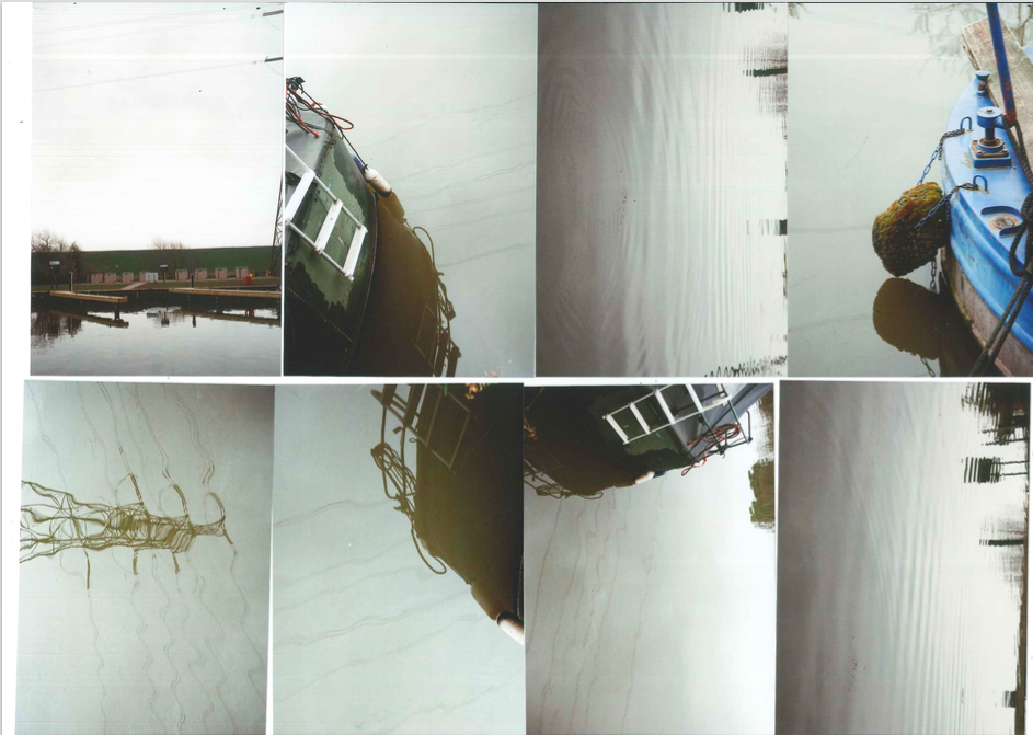
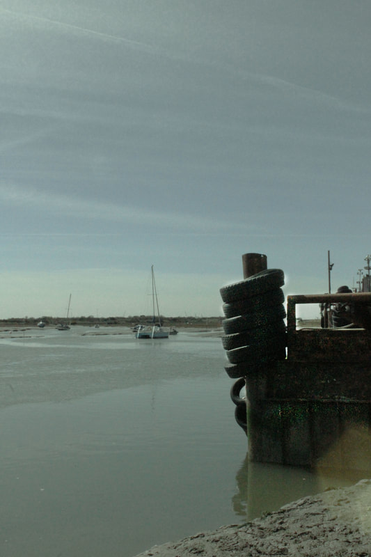
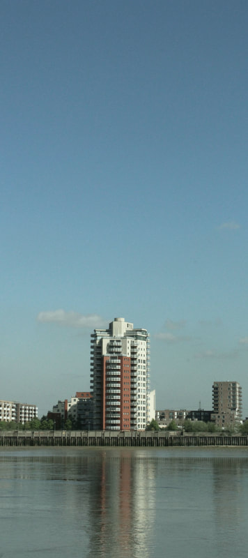
For my first response to Nadav kander's series 'Dark Line', I used a film camera to photograph the Haringey Estuary in Tottenham to explore how I could limit the movement of water by capturing the movement of the waves in the photograph. I aimed to reflect Nadav Kander's style in my photographs by composing the image so that there is an imbalance between the ratio of water and sky in the photograph, limiting the amount of water seen in the image. I was physically limited by using the film camera because I could not see exactly what photographs I had taken, which was interesting because it made me concentrate more on each photograph that I was taking. I experimented with different angles to change how much sky and water were in the photograph as well as taking some pictures angled downwards so only the water could be seen to respond to the angles used in Kander's 'Dark Line' series.
|
|
After seeing my developed film photographs, I found that it was difficult to get an effective image in response to Nadav Kander because there were a lot of structures reflected in the water which made the image less calm and isolated and more chaotic. There were also a lot of trees that obstructed the line between the sky and the water, contrasting with Nadav Kander's photographs where the sea seems to almost blend into the sky.
When developing this idea further, I could try photographing different locations such as the Thames to photograph an area where there are less structures reflected in the water and more open space, or experiment with using photoshop to edit out some reflections and structures and alter the colours to create a more isolated and dramatic atmosphere.
When developing this idea further, I could try photographing different locations such as the Thames to photograph an area where there are less structures reflected in the water and more open space, or experiment with using photoshop to edit out some reflections and structures and alter the colours to create a more isolated and dramatic atmosphere.
|
My photographs
|
Nadav Kander's photograph
|
|
|
|
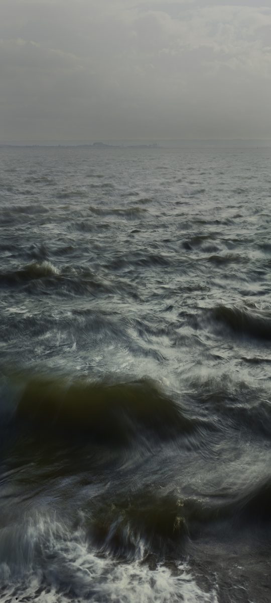
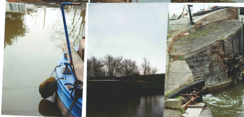
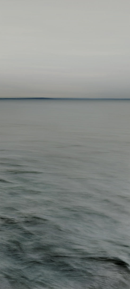
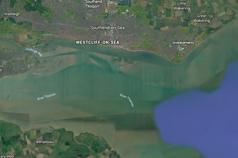
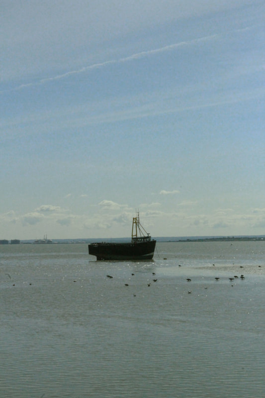
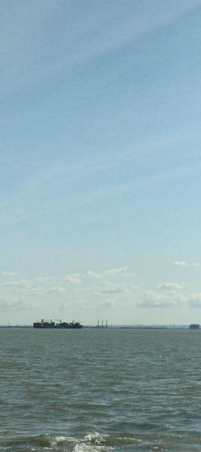
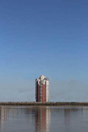
Response 2: Southend-on-sea
|
For my second response to Nadav Kander's series 'Dark Line', I visited Southend-on-sea to photograph the are where the Thames connects to the sea. I photographed this area because I wanted to create a sense of freedom in the photograph - this is the area where the refined river opens out into the open ocean. This relates to Nadav Kander's series because he also photographed the area where the Thames links to he ocean. I found this area an effective place to response to the photographer because there were often no structures on the horizon line where the sky meets the sea, creating a clear, straight line between the sky and the ocean. I also tried to photograph so that the sky took up the majority of the photograph, making the image seem weighed down by the vast expanse of blank sky. I also tried to include a structure in each photograph, either on the horizon line or between the horizon line and where I was standing. This broke up the photograph and created depth within the composition. As well as photographing the sea and sky, I also photographed with the angle of the camera pointing directly downwards to limit the movement of the waves in different areas around Southend. Unfortunately, I photographed Southend on a bright sunny day, which contrasted with Nadav Kander's photographs because he photographed in misty, grey weather. However, I can experiment with using photoshop to alter the atmosphere of the photograph to make it more melancholy by editing the colour balance, vibrance, contrast, saturation etc.
|
Digital photographs
|
|

|
|
|
|
|
|
Film photographs
My photographs
|
|
|
Nadav Kander's photograph
|
After comparing my photographs to the photographer's, I confirmed my thoughts that although the composition of my photographs was effective, they are too bright and blue. I am now going to experiment with photoshop to alter the colour balance of my photographs to create a more melancholy and dramatic atmosphere. |
Photoshop edits
I edited my photographs on Photoshop to alter the colour balance, vibrance, saturation etc to make the atmosphere of the photograph more desolate and melancholy. I added an emerald filter to make the photographs more green. I also turned down the saturation and contrast. I made the photographs slightly darker because Nadav Kander's photographs are quite dark and mysterious, without much contrast between the sky and the ocean.
|

|
|
|
before editing |
after editing |
After comparing my edited photograph with the original and also Nadav Kander's photograph, I found that my edited photographs were still too blue and many of them were too light, without the dramatic atmosphere created in Kander's photographs. When developing this idea further, I will experiment with using a more saturated colour filter, and i could also try using the burn tool on photoshop to make the sea or sky darker to create more contrast and add to the atmosphere of the photograph.
|
|
Response 3: Hampstead Heath
|
After visting Southend to photograph the area where the Thames meets the ocean, I photographed various ponds in Hampstead Heath to experiment with the composition of the photograph. In Nadav Kander's photographs, there is an imbalance of sea and sky - one of them takes up the majority of the photograph, weighing down the photograph and creating a sense of isolation by having a large expanse of empty sky. I tried to reflect this technique in my photographs by angling the camera towards the sky so that the water only took up a small section of the photograph. I was not completely happy with these photographs because there were trees behind each of the ponds which separated the water from the sky so that there was not a clear line between them. To improve these photographs I could experiment with using photoshop to edit out some of the trees so that there were only one or two trees separating the sea from the sky. |
|
|
|
|
|
|
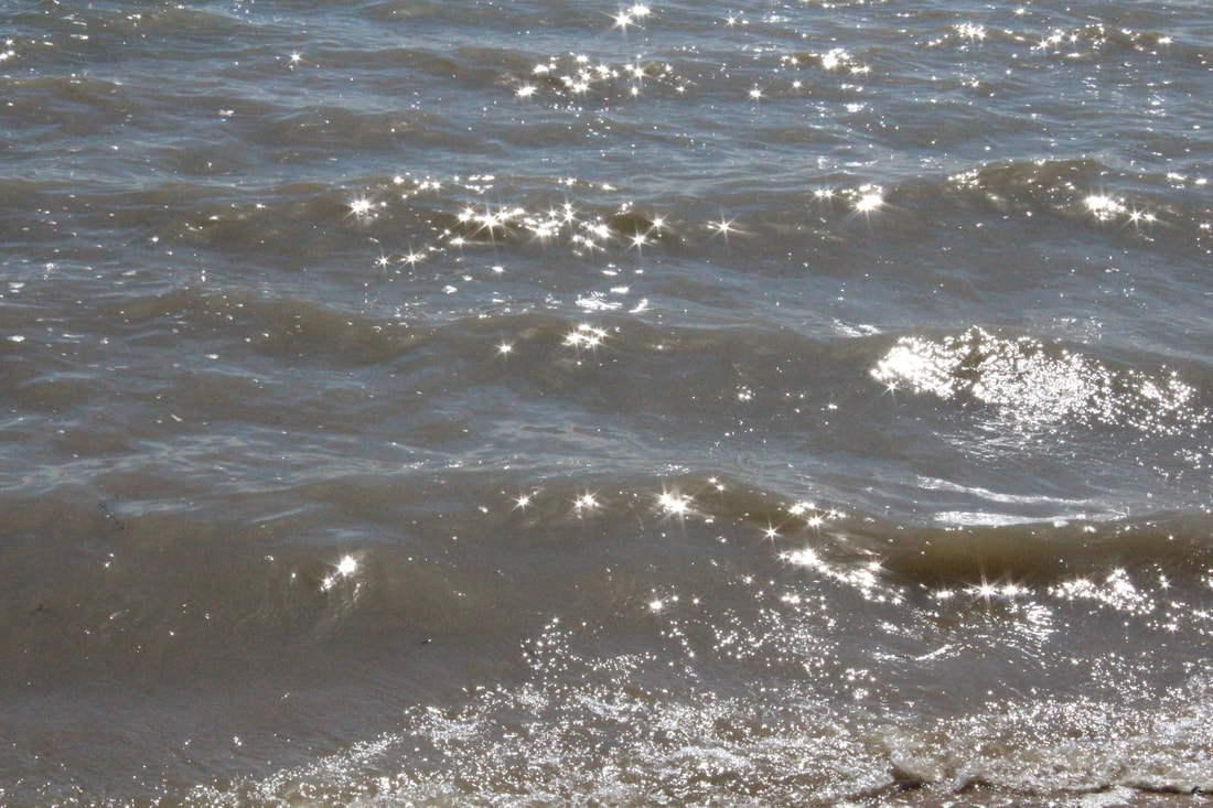
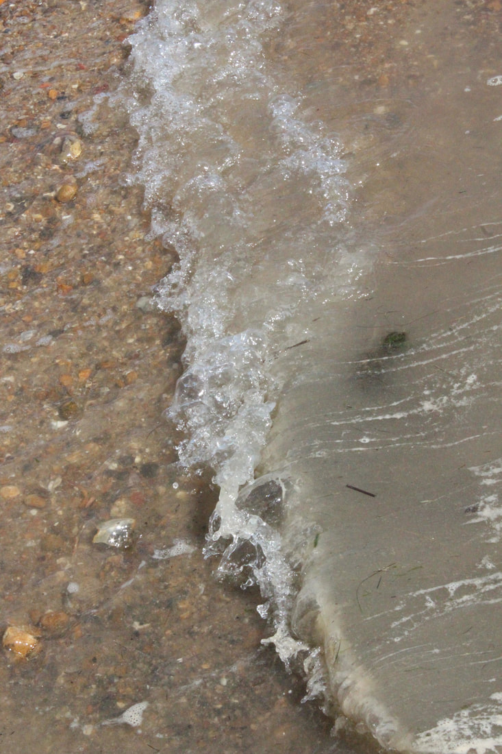
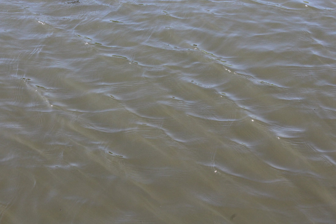
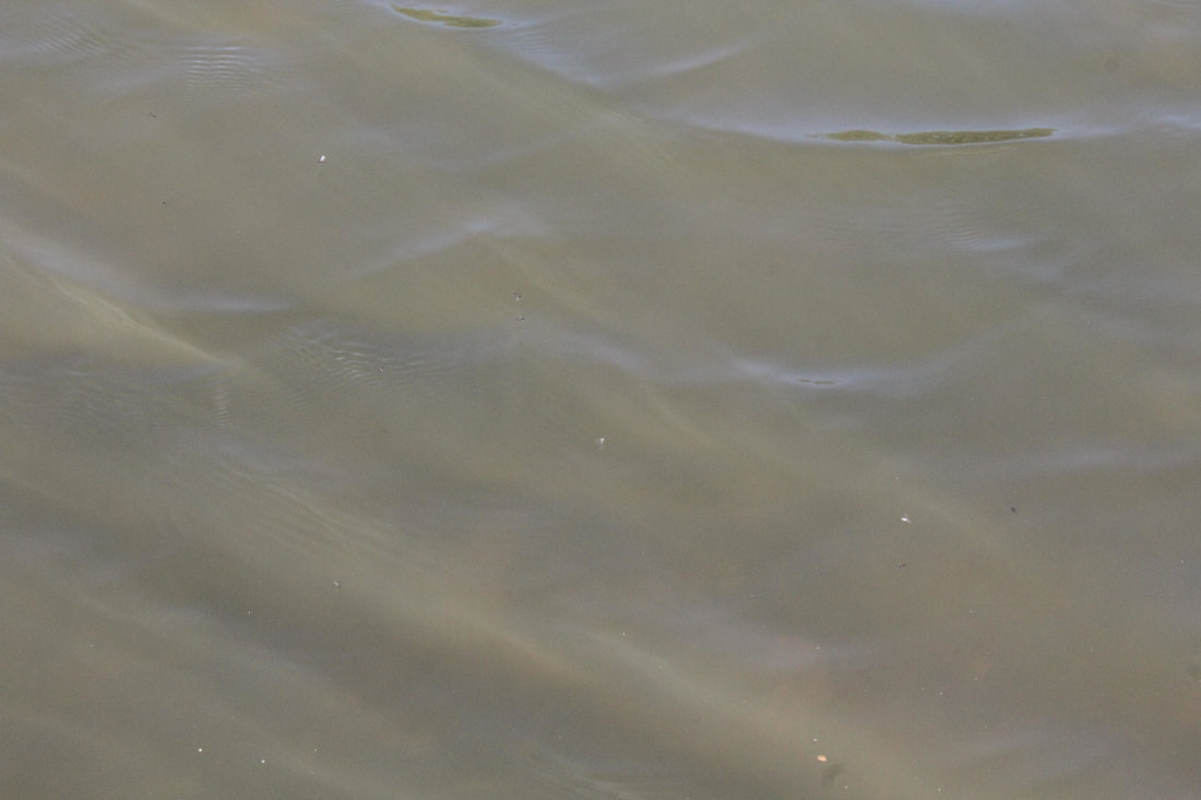
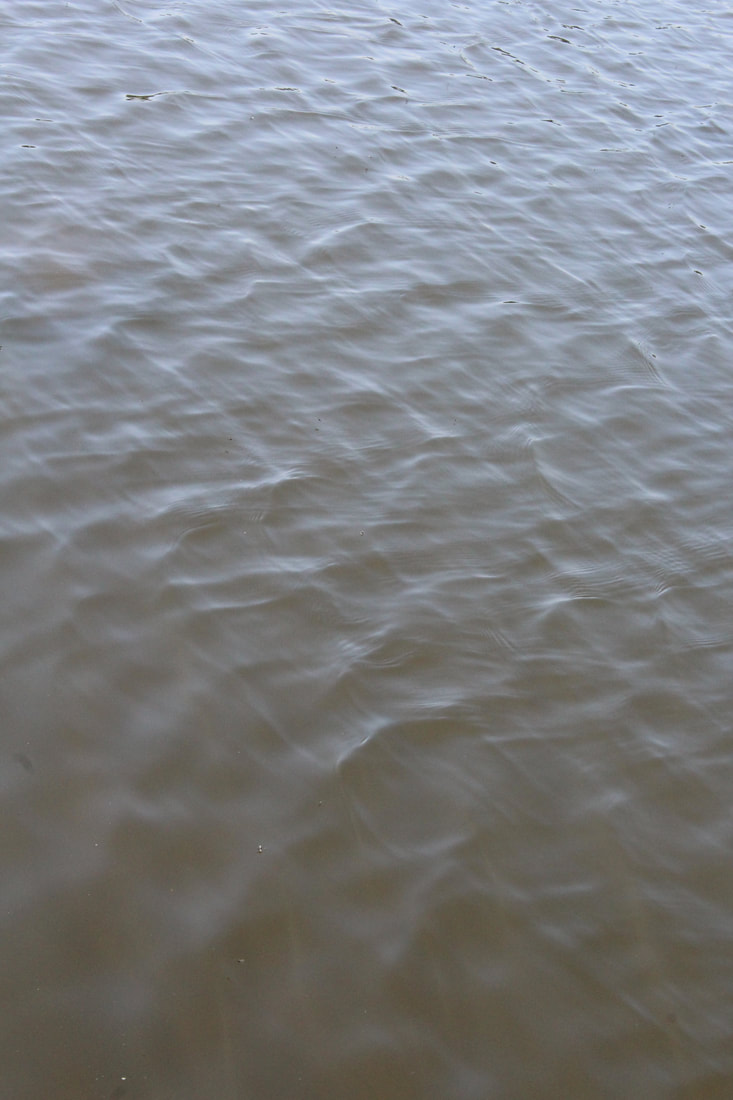
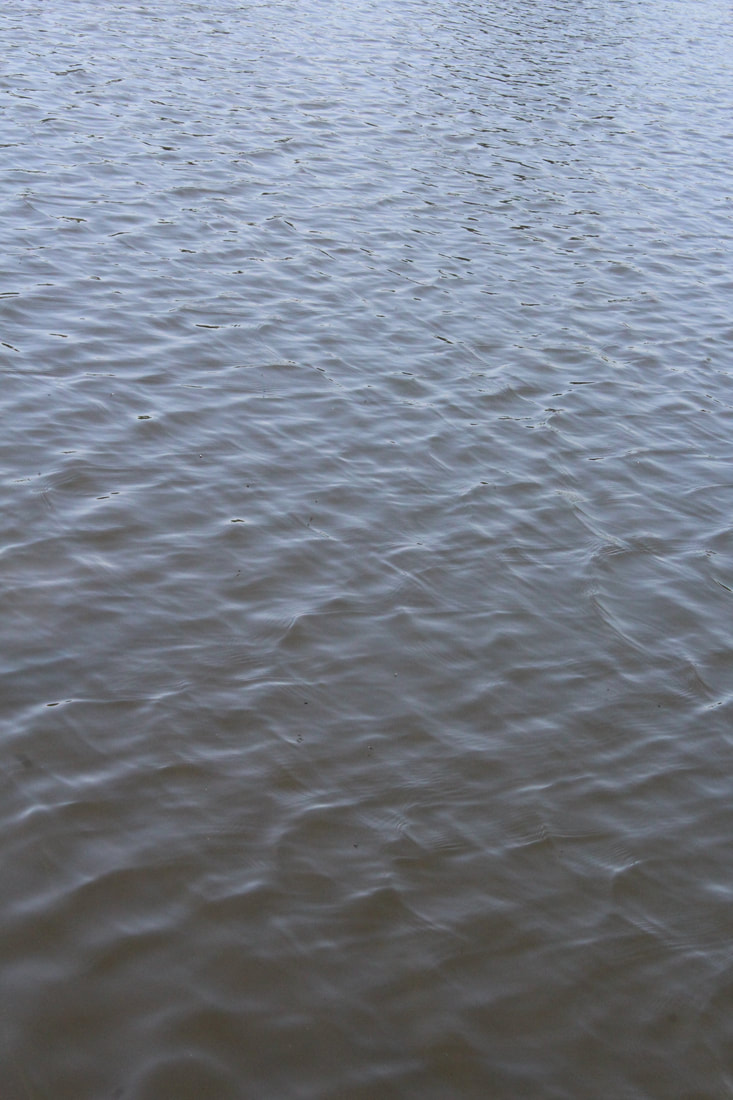
Artist link: Roni Horn - Still Water
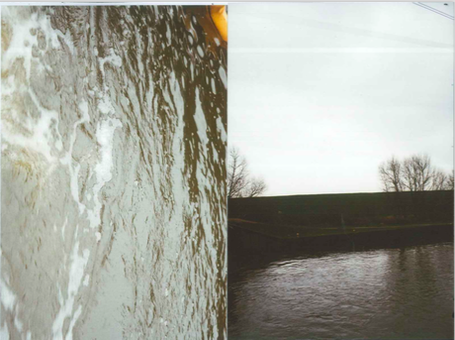
As well as taking photographs of the water in response to Nadav Kander's series 'Dark Line', I also experimented with photographing the movement of water in response to Roni Horn's series 'Still Water'.
Roni Horn is an artist and photographer who focuses on humankind, weather, literature and poetry in her work. In her series 'Still Water', she photographs the Thames and various other water fronts, exploring how the river is central to London and the mood and atmosphere of the water. The photographer includes footnotes underneath each photograph, which include quotations on the significance of the river and the moods and narratives that it evokes. I find the photographs effective because the image is photographed at a downwards angle, directly towards the water so that there is no structures or sky shown in any of the photographs. Each photograph has a different colour and different atmosphere created by different patterns and textures of the waves. I tried to reflect this idea when taking photographs at Hampstead Heath by photographing water in different areas and different ponds to create contrast between colour and areas with lots of movement and areas with less movement.
Roni Horn is an artist and photographer who focuses on humankind, weather, literature and poetry in her work. In her series 'Still Water', she photographs the Thames and various other water fronts, exploring how the river is central to London and the mood and atmosphere of the water. The photographer includes footnotes underneath each photograph, which include quotations on the significance of the river and the moods and narratives that it evokes. I find the photographs effective because the image is photographed at a downwards angle, directly towards the water so that there is no structures or sky shown in any of the photographs. Each photograph has a different colour and different atmosphere created by different patterns and textures of the waves. I tried to reflect this idea when taking photographs at Hampstead Heath by photographing water in different areas and different ponds to create contrast between colour and areas with lots of movement and areas with less movement.
|
|
My Response:
|
|
|
|
I think that these photographs were effective because I angled the camera downwards so that no structures or sky can be seen. I tried to create contrast between the photograph by finding areas with different colours and different wave textures. If I choose to develop this idea further, I could think about photographing different areas of water such as the Thames to experiment with different textures and colours and compare them to the photographs that I took on the Heath. I also found that there was not much colour contrast in the photographs that I took of the ponds in the Heath, so I could try to find different areas with more clear or blue water, as well as experimenting with colour on photoshop.
To do:
> continue experimentation on water sources and creating an isolated atmosphere
> use photoshop to alter the atmosphere of the photographs - so far they are too bright and blue so I can try using a more saturated filter and try comparing my photograph to Nadav Kander's while editing the photograph in photoshop to try to reflect the same atmosphere.
> go to Alexandra Palace
> go to the Thames Barrier
> focus on negative space, colour, detail, isolation
> experiment with photoshop - see if editing structures out of the photograph is effective
Response 4: Alexandra Palace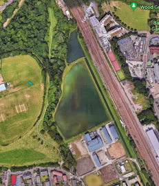
|
|
For my fourth response, I photographed the 'new river' in Alexandra Palace to further develop my ideas about creating an atmosphere of mystery and drama using negative space, colour, detail and isolation. I tried to keep the horizon line between the sky and water in the same place in each photograph so that there is a continuous line across all of the photographs when displayed next to each other. These photographs were effective because the sky was very blank and clear, and I managed to achieve a continuous horizon line using the view finder grid when looking through the camera to keep the line in the same place each time. I also cropped the photographs similarly to how Nadav Kander cropped his photographs for his series 'Dark Line' - I made the photographs tall and slim so that there was a large expanse of sky that weighed down the photograph. However, I found it difficult to have a clear split between the water and sky because there were trees and other structures such as a train station positioned across the horizon line, and there were many things obstructing the photograph such as a fence and tall plants around the water. I also found that the photographs were very bright because I photographed the area on a bright and sunny day so if I were to develop this idea I could think about using photoshop to edit out some of the structures and alter the colour balance and add a photo filter like I did for the photographs that I took at Southend.
|
|
|
|
Development: photoshop edits
Original photograph - there are plants showing at the bottom and lots of structures obscuring the horizon line
|
1. I first cropped the image so that the sky took up the majority of the photograph and the image was long with a shorter width. I then used the clone tool to remove all of the structures from the horizon line so that the water joined up with the sky line 
Nadav Kander's photograph 
|
2. I then edited the colour balance, vibrance and saturation and applied an emerald colour filter to give the photograph a more dramatic and moody atmosphere, similarly to Nadav Kander's series 'Dark Line. 
My photograph 
|
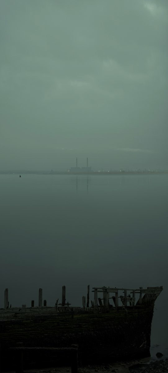
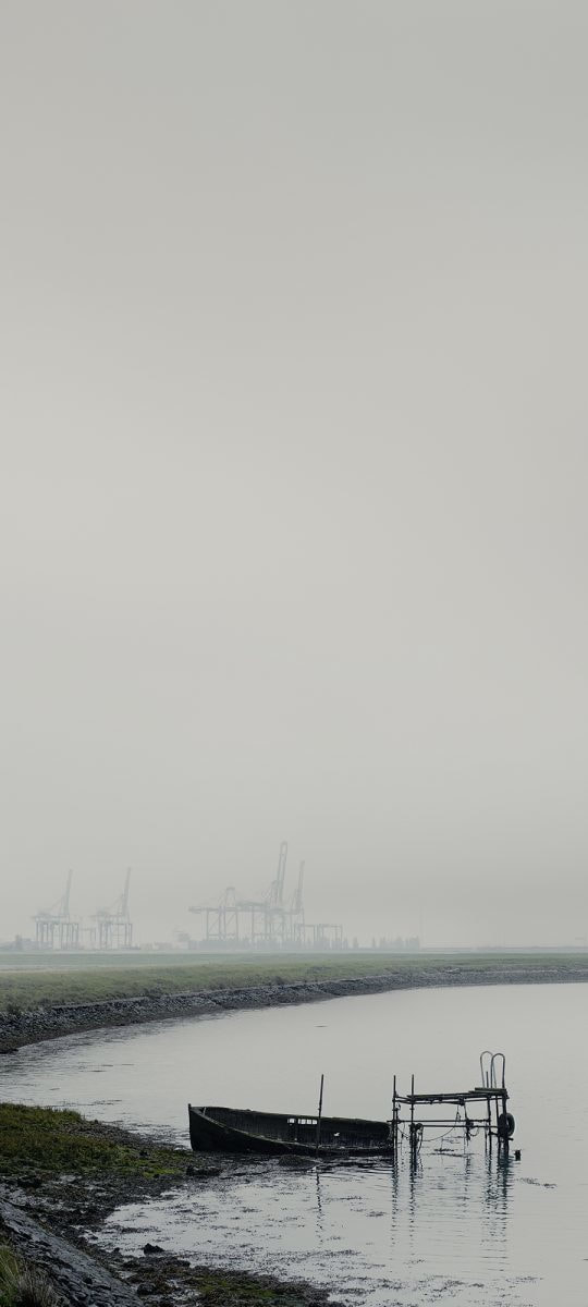
Evaluation: I am happy with the colour balance in this photograph because the dark green filter and low contrast and vibrance create a melancholy and dramatic atmosphere, similarly to the atmosphere created in Nadav Kander's photograph. However, when comparing the two photographs I found that the balance between the sea and water in my photograph was different to Kander's - although there was not a lot of contrast between the sky and the sea, the photographer has composed the photograph so that the sky and sea are almost the same ratio, so when developing this idea further I will experiment with the ratio of sea:sky in my photographs but I have found that in many of his 'Dark Line' photographs, Kander has used a large amount of sky and a smaller strip of water at the bottom, which I find more effective than having equal amounts of water and sky because it weighs down the image and creates a heavier atmosphere. I also noticed that the photographer often includes structures along the horizon line of his images, which separates the sky and sea, so when I visit different locations to develop this idea I will keep this in mind.
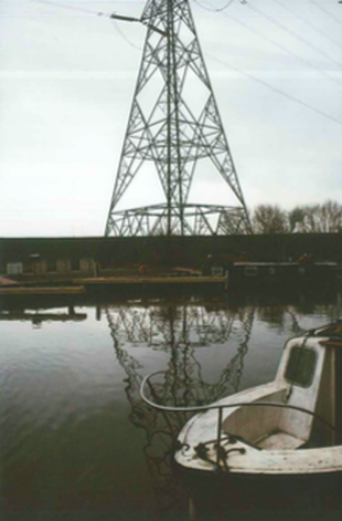
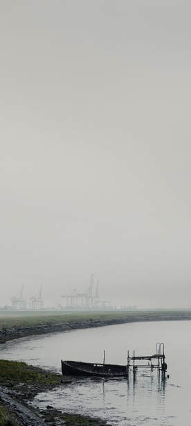
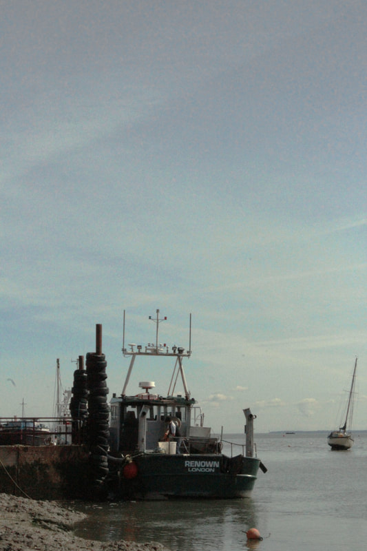
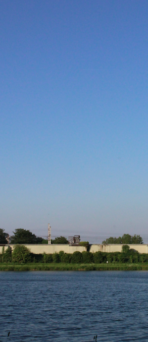
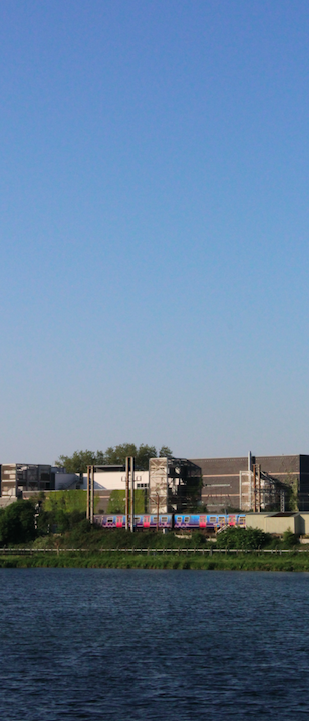
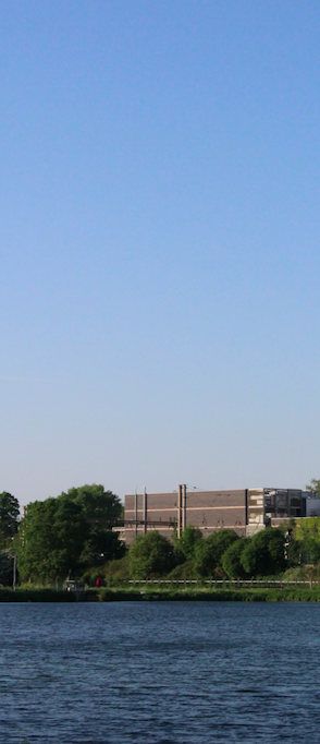
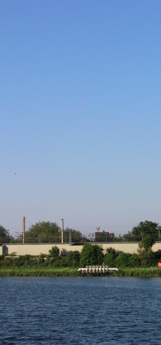
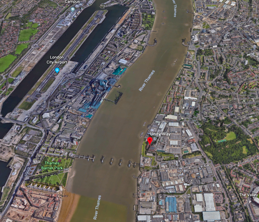
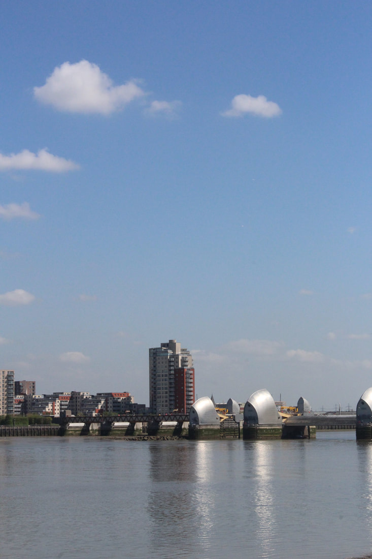
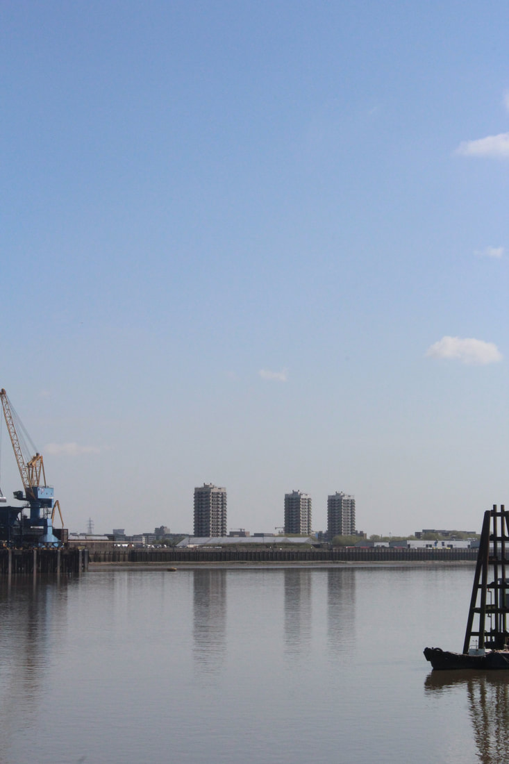
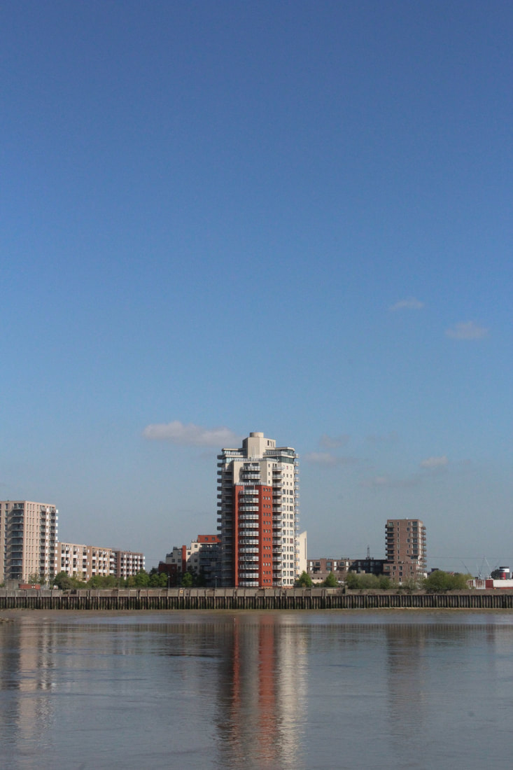
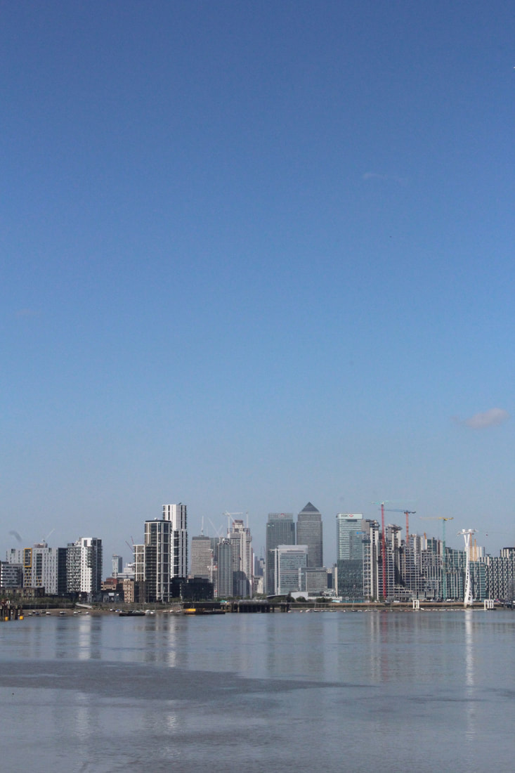
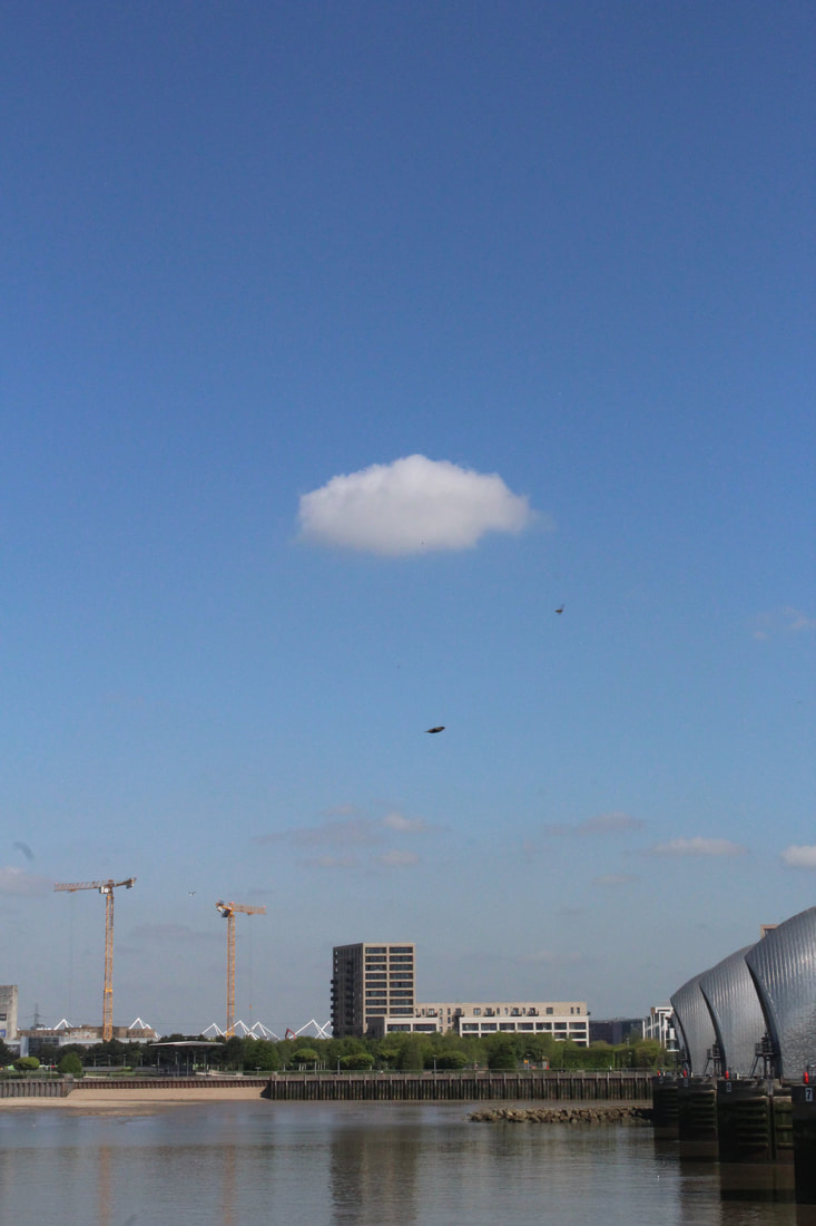
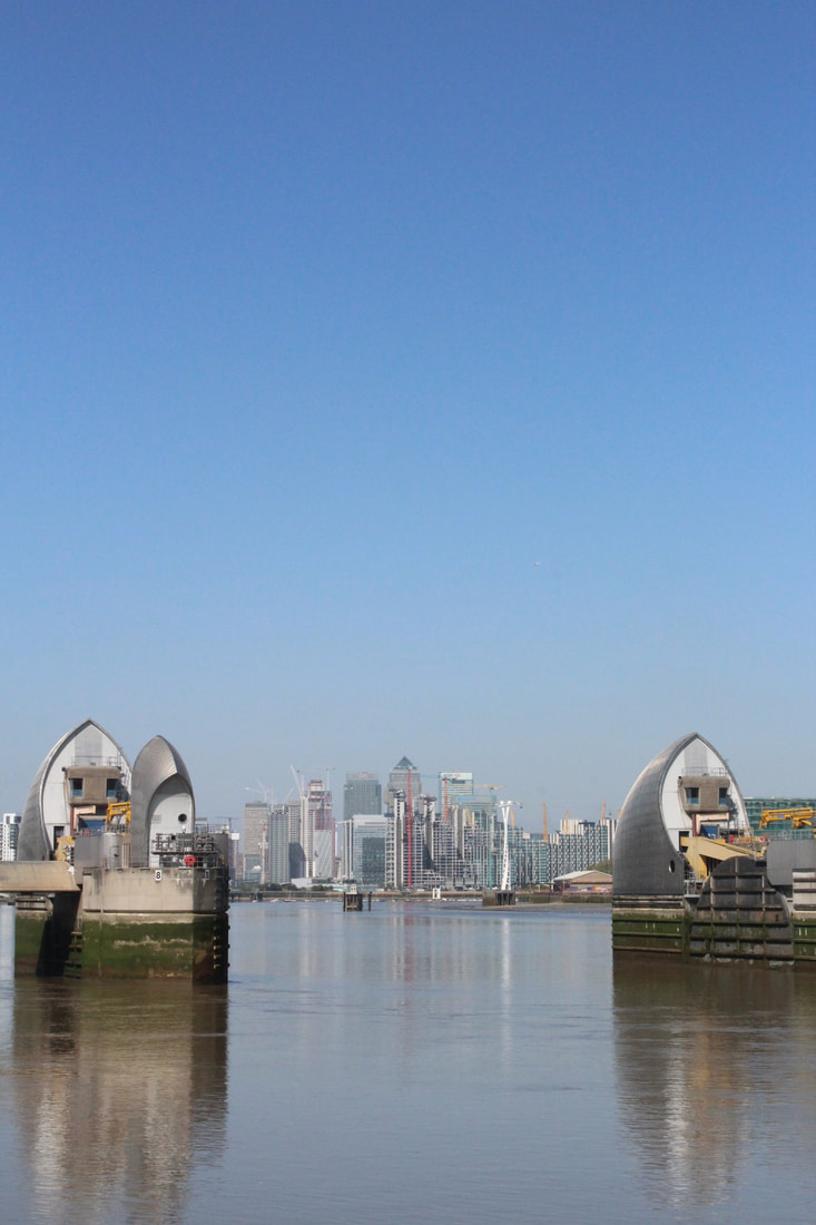
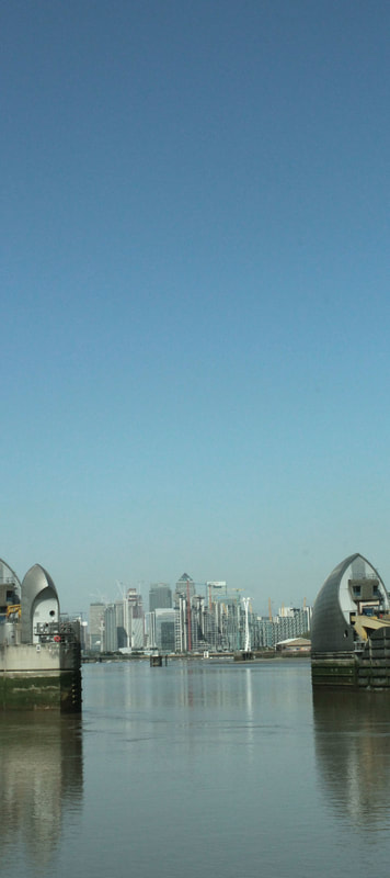
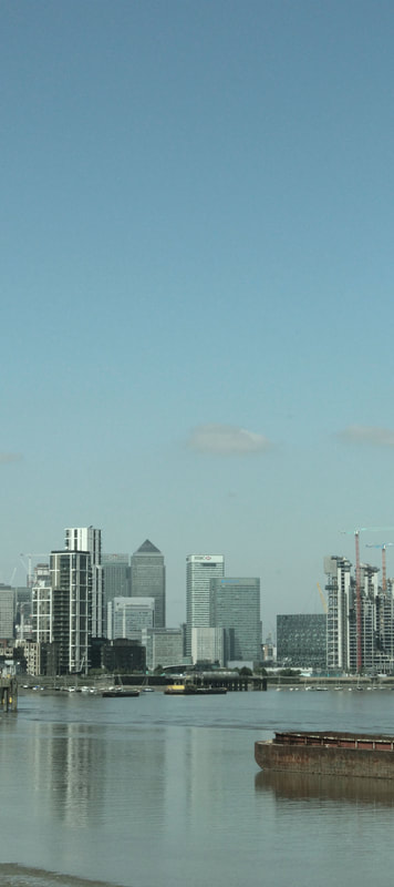
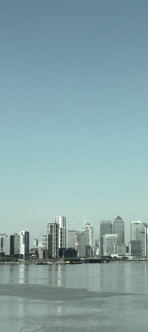
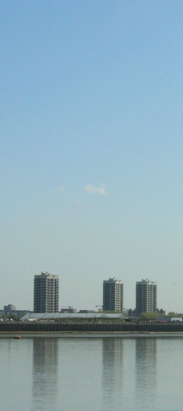
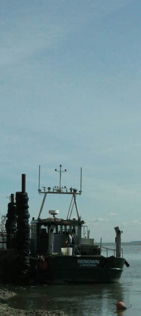
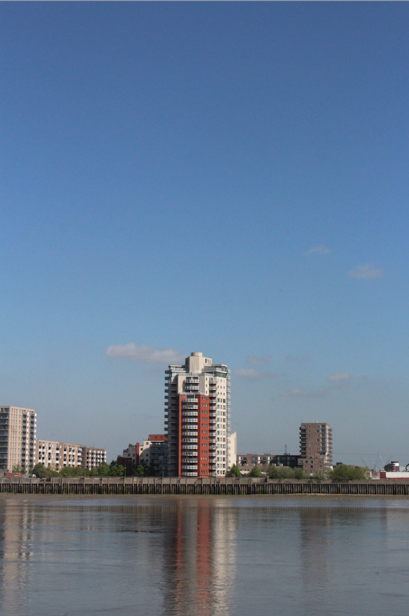
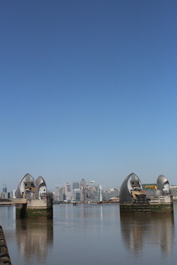
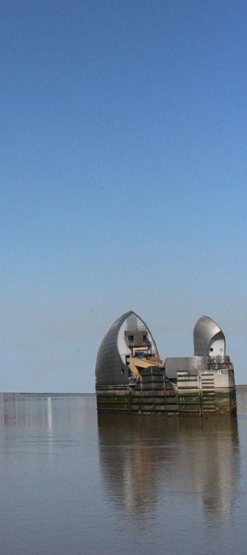
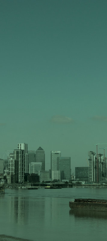
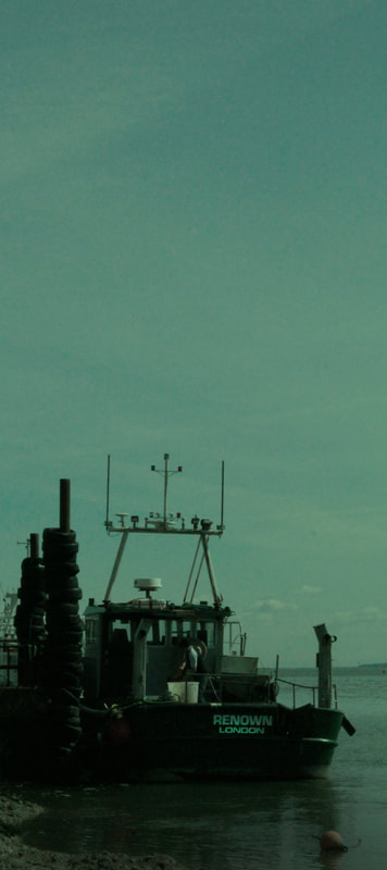
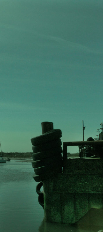
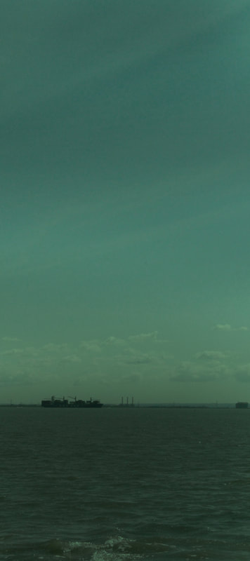
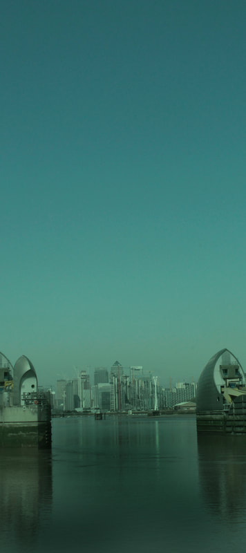
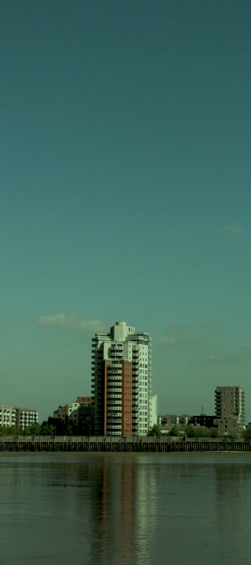
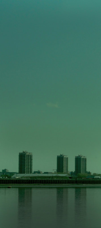
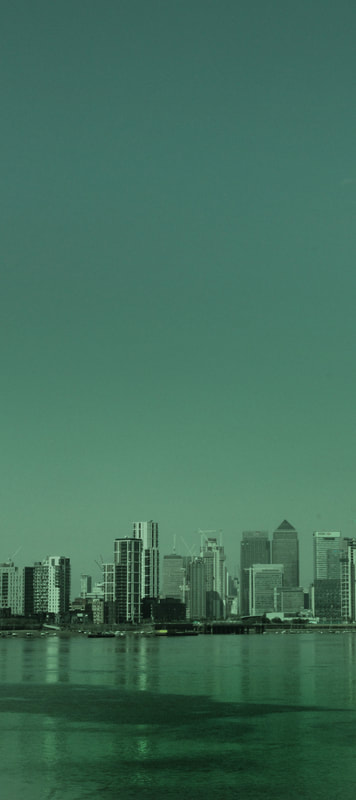
Response 5: Thames barrier
|
After visiting the water source at Alexandra Palace, I decided to revisit the Thames in a different area - I had previously photographed Southend-on-sea, which is where the Thames meets the sea, so I decided to photograph the Thames Barrier, which is in a place that is more urbanised. The area that I photographed was next to London City airport in North Greenwich. I found that there was a big contrast between Southend and the Thames Barrier - when I photographed Southend I was photographing the wide stretch of ocean with no structures obscuring the horizon line, compared to the Thames Barrier where there were a lot more buildings on the other side of the river obscuring the line between the sky and the river. I found this contrast effective because it showed how the river changes drastically as it moves further away from the centre of London. I had also noticed that Nadav Kander often uses structures on the horizon line to break up the point where the sky meets the sea in some of his photographs, while in other photographs there is a large expanse of empty space with no structures along the horizon line. This creates an interesting contrast between different areas and I will consider this when photographing the Thames Barrier because I have already photographed Southend which has large expanses of empty sea and sky.
|
|
Chosen images
|
|
|
|
|
|
final piece development
I have decided to include a combination of photographs from different locations in my final piece. I am using my best photographs from Southend-on-sea and the Thames barrier. I chose to use these locations because they both link to photographer Nadav Kander's 'Dark Line' series as they are both of the Thames, but they are in different locations along the river, which I found was effective because there is a contrast created between the isolated open space of Southend leading out into the open ocean, and the Thames Barrier with structures breaking up the horizon line. I included both of the locations because I found it interesting how different areas along the river are so contrasted with each other (built on vs isolated), showing the freedoms and limitations of different areas. I chose photographs that I thought suited each other and related to the composition used in Nadav Kander's photography - I composed the image so that there was a large expanse of blank sky, weighing down the photograph to a strip of water in the lower section, with a structure either along the horizon line or in the middle of the water, adding depth and a focal point to each of the photographs.
First development: I started by using my chosen pictures from the Thames Barrier and Southend and cropping them so that they were longer and less wide. I then used photoshop to edit the colours to create a more melancholy atmosphere. I started by editing the colour slightly to see whether I preferred the photograph to have more blue and grey colours, but I will also experiment with using more saturated filters to create the dramatic atmosphere reflected in Nadav Kander's work.
First development: I started by using my chosen pictures from the Thames Barrier and Southend and cropping them so that they were longer and less wide. I then used photoshop to edit the colours to create a more melancholy atmosphere. I started by editing the colour slightly to see whether I preferred the photograph to have more blue and grey colours, but I will also experiment with using more saturated filters to create the dramatic atmosphere reflected in Nadav Kander's work.
|
|
|
|
|
|
|
|
|
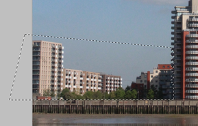
Second development: I decided to experiment with editing some of the structures out of thames pictures to make the photographs more minimalistic and keep one structure as the focal point of the image. To do this I first used the lasso tool to select the area that I wanted removed. I then used the clone stamp tool to block in the selected area with the same colour as the sky. I found that although this technique was effective for isolating one or two structures in the image, it was difficult to make the image look realistic and I often found that as the sky is made of many slightly different colours, using one colour to block out the area was not as effective as I had hoped. If I choose to experiment with this idea further, I could try using a combination of different colours to block out the selected area and see if that has a more realistic effect.
|
|
|
|
|
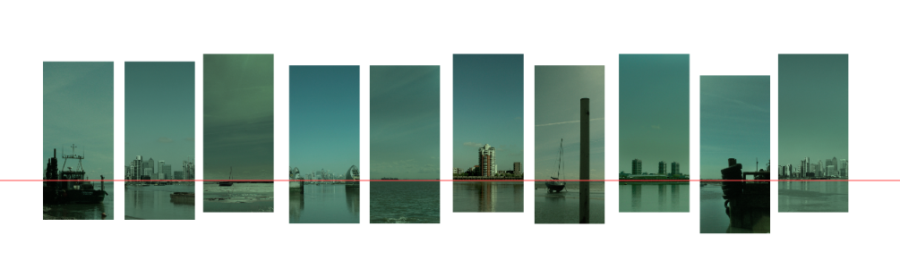
Third development: experimenting with the position of the images. I made a photoshop document and drew a line across the centre of the document. I then copied and pasted some of my photographs onto the document, lining up the photographs so that there is a continuous water line across the page.
I first cropped the photographs all different lengths and widths. I found that this made more of a difference in the alignment of the photos, but I felt that the composition seemed unbalanced with some of the photographs thinner and shorter than others, so I experimented with cropping all of the photographs to the same width and length. I found this more effective because it creates balance in the composition because all of the photographs are the same size and the waterline is in the same place along the composition, but the position of the photographs on the display will be slightly staggered as the position of the waterline changes.
I first cropped the photographs all different lengths and widths. I found that this made more of a difference in the alignment of the photos, but I felt that the composition seemed unbalanced with some of the photographs thinner and shorter than others, so I experimented with cropping all of the photographs to the same width and length. I found this more effective because it creates balance in the composition because all of the photographs are the same size and the waterline is in the same place along the composition, but the position of the photographs on the display will be slightly staggered as the position of the waterline changes.
final piece
To make my final piece, I decided to edit my chosen photographs so that they had a more dramatic atmosphere (I experimented with this idea in my Alexandra Palace response and I found this effective because it creates a more dramatic atmosphere using a saturated emerald filter with low vibrance and low contrast). I find this effective because it turns the bright blue photograph into a more moody and mysterious image. The piece relates to the theme of freedom and limitation because the composition limits the amount of water seen in the image by having a large expanse of sky that weighs down the photograph.There is also a sense of freedom created in the Southend photographs as the river opens out into the ocean, contrasting with the Thames Barrier pictures which are limited by the structures on the other side of the river. The way that I am going to display the final photographs is going to be so that the images are lined up along the water line so there is a continuous horizon line across all of the photographs, which will stagger the images because the water line is slightly different in every picture.
|
|
|
|
|
|
|
|
|
|
arrangement of final piece: I have copied and pasted my final photographs into a photoshop document to experiment with the arrangement of the photographs. I found that it is most effective to alternate the Southend and Thames Barrier photographs to create a more staggered effect and create contrast of freedom and limitation between each image.